image comics

The Wicked and The Divine

The Wicked and The Divine

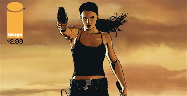
The Wicked and the Divine is a graphic novel of a new, wonderful breed that is thankfully receiving its dues in the world of comics right now. These include Saga, Sex Criminals, Rat Queens and many more, but what they all have in common is this fantastic ability to get right to the heart of a very strange scenario, quickly. They all have a mythology of one form of another, a language through which the story is told, and for The Wicked and The Divine McKelvie and Gillen have picked a classic idea – rockstars as gods, or gods as rockstars – and made it completely their own.

IMG_0283

For those who haven’t read any yet, the premise is a simple one. Every ninety years, twelve gods and goddesses, known as The Pantheon, are reincarnated in ordinary people. They become the idols of that time – it just so happens that this time around, pop and rock stars are the closest thing we have to gods among us.

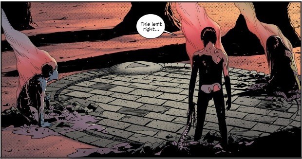
When they perform it’s like a spiritual experience, complete with fans – worshippers – fainting in the crowd. But the price of being famous and being loved is that they have only two years to live. As you can imagine, this is quite difficult for the teenagers in question – especially the youngest, Minerva, who knows she’s going to die before she turns fourteen.

the-wicked-the-divine-002

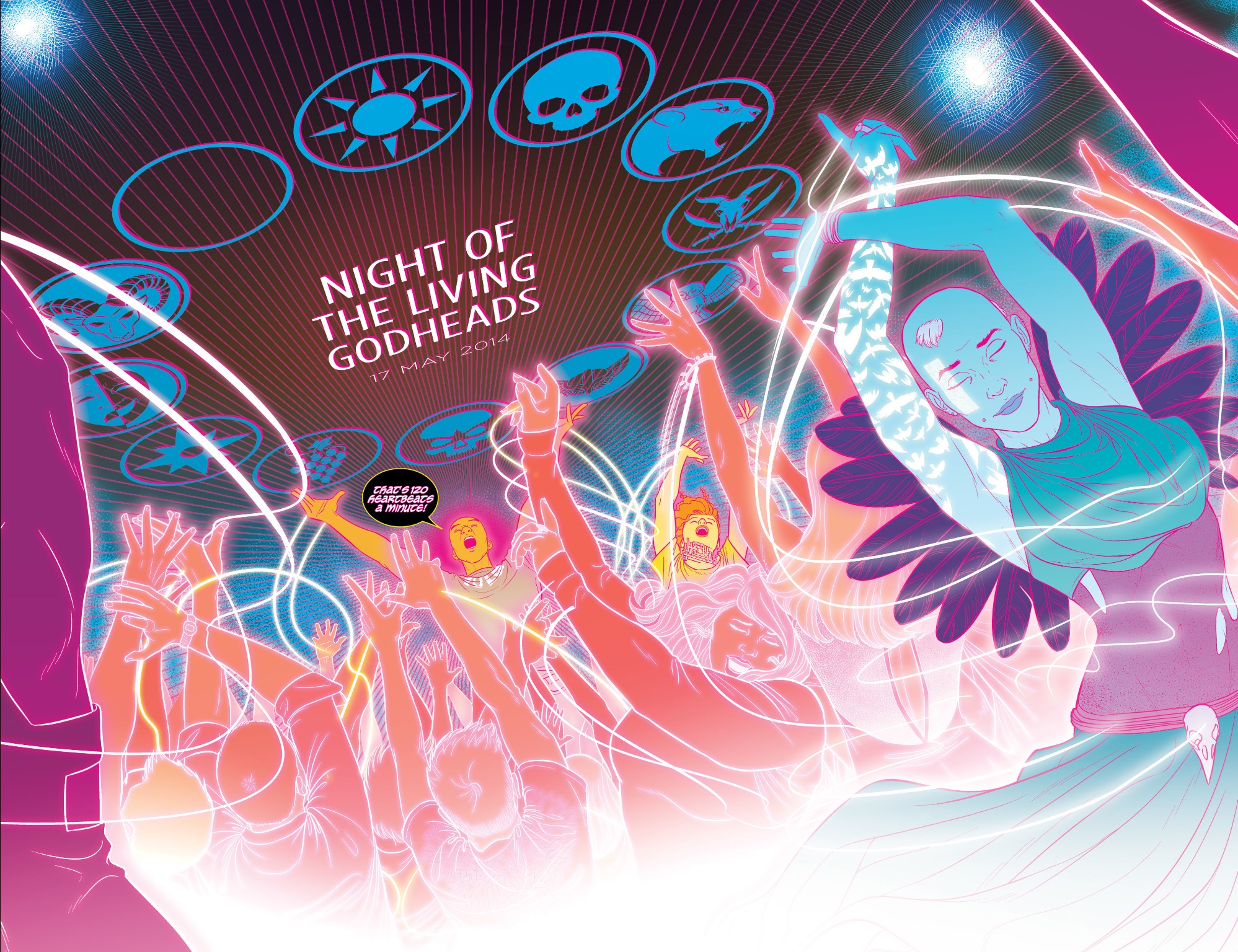
Every page is beautiful, and carefully thought out. The space is used artfully, with entire pages devoted to portraying blackest depths. Form and frame are shifted to create an effect that draws your eye across the page, making it impossible to put down, and the way it can illicit feelings, moods and experiences is truly masterful. One rave scene in the second trade paperback is particularly evocative; a calculated assembly of lights, colours, and variation in form that TV and film couldn’t even begin to emulate.

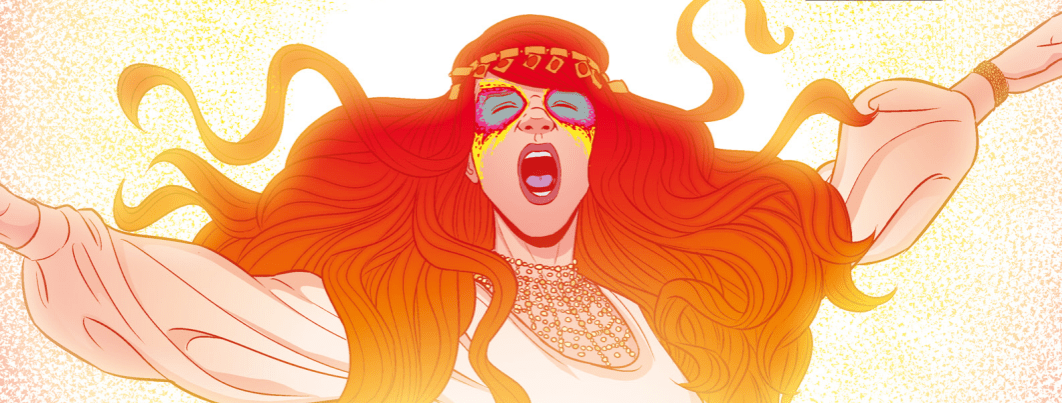
In the trade paperbacks The Faust Act and Fandemonium, chapters are interspersed with portrait images of the gods we meet. All of the characters are so carefully thought out that you can tell a huge amount about their personalities just by seeing these portraits, so exquisitely crafted by McKelvie. An important shout-out also goes to Matthew Wilson for the sumptuous colouring, and Clayton Cowles for the lettering which has all the inventiveness of The Sandman in its assigning of fonts to a character. In short, it looks incredible.

wicked-divine-8-party

But it isn’t just a pretty face. The amount of effort that must have gone into creating the mythology and back story, the choices of Gods from various religions and the anachronistic nature of true belief in the twenty-first century all show how perfectly sculpted these books are. The telling of the story flows naturally in the voice of our seventeen year old protagonist, as she bears witness to the Recurrence and becomes haplessly involved in it.

In fact, all of the voices sound authentic, even coming as they do from such a diverse cast of characters, but especially from Laura. Gillen manages to capture the fiery defiance of a teenager, complete with the new and exciting stresses that have come with the social media age, without being at all patronising. Laura’s flawed, to the point where you want to grab her by the arms and shake her out of her misguided fantasies, but as an audience we can understand her desire to be as special as the Gods she admires.

Screen_Shot_2014-12-17_at_9.28.30_AM.0

I hesitate to say much because there is so much joy to be had from reading The Wicked and The Divine. The story takes such unexpected turns that by the time you’ve finished reading you realise you can’t go any longer without knowing what horrible, magical thing is going to happen next! So far the first two volumes have been released in Image’s wonderful little volumes, and while it’s killing me not to talk about the huge cliffhanger that the second left on, it’s well worth discovering for yourself.

So please do, then we can get excited about it together!

Posted by jenny in Comics, 0 comments
Lazarus issues #1 and #2

Lazarus issues #1 and #2

My first introduction to Greg Rucka’s writing was in the Batwoman reboot. I lapped it up, being a huge fan of the Batman mythology and also a big fan of strong women. I looked more and more into Rucka, and found that this was a common theme of his. So of course when I saw the cover of Lazarus issue one – the dark, furious woman with a bullethole in her head, I was intrigued. The second issue drew me in further, showing Forever strolling down a desert highway toward the viewer with gun raised and sword drawn behind her. She looks like a less-sexualised Lara Croft: wearing sensible black military clothes, utility belt and pony tail flying in the wind, she’s certainly attractive but more importantly she’s athletic. Going through the pages, it’s clear that Forever has been modelled after athletes, with an appropriate body to match. But we’ll get to that later.

The first issue has just a few words which explain the state of the world. In the future, all power is related to wealth and the few “Families” who own that wealth rule the citizens they deem useful to them; anyone without a registered allegiance is considered Waste, and left to fend for themselves. Each family has a Lazarus, a member of the Family who has been given all the scientific and medical advances possible in order to protect the interests of that Family. In an interview, Rucka described the Lazarus as the “bloody sword and iron shield of the Family”, and explained that the Lazarus is not immortal, just capable of recovering from injuries no ordinary human could thanks to a level of science nearly indistinguishable from magic. This isn’t a spoiler by the way, as the first few pages show a clinical examination of Forever dying from serious wounds.

The attack is narrated in a medical and forensic way, detailing each wound and its effect. It becomes apparent when her eyes open and she goes after the men; this whole scene has a cold blue feel but when she finds the men and uses her superior fighting skills and strength, their deaths are highlighted in a backgroundless pink/purple hue that feels something like a film effect where a person’s life is drained out of them. Back in the sterile green doctor’s office, she confides in him that she feels bad about killing the men as they only wanted food. Already we get into the class issues of the comic, and Forever’s internal struggle to be okay with what everyone else in her Family believes it right. The doctor betrays her confidence immediately, contacting her brother Jonah and warning him that she needs to feel some positive reinforcement – that somebody loves her. He unwillingly agrees.

The concept is interesting already. Unlike many dystopian futures told by the rebel or the underdog, Forever is one of the elite. More than that, she’s a product of the elite, charged with protecting everything her Family deem important but in some ways more human than them. There are clear differences between Forever and Jonah. She’s dressed entirely in military gear, he’s in a dark suit with his hair slicked back. She looks positively confused that he hugs her. He explains that there was a raid on the compound by one of the other families, the Morrays, and that it must have been an inside job. When Jonah calls in all of the staff who could have done it, he threatens to kill them all and their families if no one confesses; when someone does, she’s almost certain he isn’t guilty, but has to kill him anyway. Before she kills him, she tells him she’ll tell his daughter he loves her – he says that she knows, a little kicker about what love and family really are.

At the end of the first issue, she’s telling the doctor she feels fine. The father of the Carlyle Family, Malcom, has brought his children together to discuss the Morray matter. This is a great way to see the different elements of the Family: the coniving Jonah, who appears to be having an affair with his twin sister Joannah (very Game of Thrones), who is absent from the meeting, the calmer but more timid Stephen, and the older sister Beth who treats Forever like a test subject. The Father dismisses Forever as “The Lazarus” behind her back, but treats her like his favourite daughter when with her; it’s obvious he is manipulating her using affection.

While Malcom speaks to Forever, the rest of the siblings fight about her in the kitchen. It becomes obvious that she’s not Malcom’s real daughter, suggesting that she was created specially for the family, but Beth goes wild at the suggestion of Forever finding out, knowing that they might lose control of her. Malcom’s splitting the kids up again, and Forever is to accompany Jonah back to Los Angeles, his own domain. The scenes of them travelling to the city which has been wrecked by earthquake show the distinct contrast between these elites in their armoured car escort drinking champagne while some kind of slum unveils behind them. “No point wasting resources on Waste who can’t appreciate it”, comments her brother.

https://i0.wp.com/d1vr6n66ssr06c.cloudfront.net/wp-content/uploads/2013/08/Lazarus.jpg?resize=640%2C330

 As she walks through the dystopian city, Jonah’s tail Mason stalks behind her, seemingly hidden. She approaches some playing children, hands them a note and walks around the corner; of course he runs after her, taking the note from the children but rounding the corner to find a dead end. He opens the paper: “If you keep following me, I’m going to kill you.” I certainly wouldn’t mess with her. The last we see of Forever is out in the desert preparing to talk to the Morray Family, but they surround her and take her prisoner. I absolutely cannot wait to see what happens next – Rucka’s commented that she and the Morray Lazarus will get on much better than you might think, and (this is just my speculation) maybe she’ll learn something about another Family’s ways which will help her to answer some of the questions her own aren’t prepared to deal with.

The character design of Forever is clearly detailed; she looks consistent panel to panel, and I don’t think we’ve seen her crack a smile once. As I mentioned earlier, they clearly put a lot of thought into how a woman would be created for such a purpose; very tall, muscular, a large ribcage to support athletic levels of breathing. And yeah, she is good-looking, but such a vain family wouldn’t have created an ugly member, and at least she’s not a cartwheeling blonde schoolgirl. When the project was first announced, she was named Endeavour, but while Forever has a similar meaning it can also be shortened to Eve, perhaps suggesting that she has the capability to change the world.

The dystopian future that Lazarus is set in was inspired by the economic environment of the world today and the Occupy movement, with the central concern being, what if things don’t get better? Like most good science fiction, it’s a social allegory, and Forever seems to represent the conflicting values of family pride/nationalism with genuine concern for other human beings. The colouring is subtle, usually consisting of pages bathed in a certain shade for different areas, and the facial expressions are exquisite, courtesy of Michael Lark. Interestingly, the mother of the Family is being kept back for now, and it really feels like Rucka and Lark are after a long run with Terminator Forever; their previous collaboration Gotham Central was a huge success for them both and they were critically acclaimed as a great partnership; with the relative freedom of Image Comics, I hope this partnership endures and we learn more about this horrible world and the heroine that you’re sure to care for by the end of the second issues.

Originally posted on the Travelling Man blog

Posted by jenny in Comics, 0 comments
Chin Music #1

Chin Music #1

Steve Niles has built a solid name for himself in horror for his works 30 Days of Night, Criminal Macabre and Transfusion among many others in which he deals with zombies, vampires, Lovecraftian monsters and the occult. Tony Harris is an artist whose primary comic experience is working with DC and Marvel, but is stylistically much more complex, also working on commercials, films and television, and this book is a fantastic example of his extraordinary attention to detail. Set primarily in two locations – Egypt and Chicago – Chin Music requires some concentration but is definitely worth the effort.


chin1

The first five pages are completely devoid of narrative or dialogue, the only words the onomatopoeic scritches and scratches of Bill Tortolini’s careful lettering which gives each sound a specific font (really, it’s beautiful). Harris’s artwork feels so strange and surreal, mixing as it does photorealistic elements such as focus and reflecting dust particles with the heavily stylised and therefore cartoonish art deco elements of the room. The framing is subtle but effective at first, leading the eye down the page and through the story, and every panel has such exquisite detail (I will talk about this a lot). Over the next few pages we watch this detective at his desk, scratching occult symbols into the tip of a bullet, and his table. Any part of the page that isn’t filled with sequential imagery is filled up with floating symbols which work to frame the narrative, and these symbols seep into the framework. By having separate panels showing lifting the match, scratching it against the table, lifting the candle and then a combined but fragmented panel showing his lighting the cigarette and then lighting the candle, the action is given this slow, precise feel. Reddish eyes glow out from beneath his fedora and he stands slowly, raises the gun out of the door and shoots. The lasting focus of this scene is in his eyes, which are bulbous and a vibrant orange surrounded by a thin ring of purple.

Suddenly, we’re in Egypt. You can tell not just because of the setting and people, but because the panels change from art deco to an Ancient Egyptian style complete with snakes and symbols. A nice three-panel sequence shows a cloaked man, who appears to have helped someone, seeming melancholy. His eyes are that bulbous, wide orange and his nose is broad and mishapen as though broken. When a stranger walks into the tent, Harris includes again that slither of realism in streaks of light breaking through the curtains, but the slightly thicker-than-life features of the characters as well as the newcomer’s glowing red eyes keep the scene from drifting into illustration. The fight and chase scene which occurs next runs through colours, oranges and reds, and the artwork feels like classic Arabian Nights comics. It can be a little tricky to tell who is who, but the key is in the eyes. They dash through fragments of panels before the pursued attempts to fly upwards into the sky, although his chasers follow him up and tear the flesh from his bones with their bar hands before crashing past the face of a sphinx. Harris’ amazing attention to texture his shown wonderfully in the sequence above Egypt – the dessert is made up of so many tiny, detailed squiggles so as to create the grainy look of sand from a distance. They scratch patterns into the bones of what is now just a skeleton, calling him “Meddler”; covered still in blood mist they kick him into the dirt of the pyramids and leave him.

As the charred skeleton crawls across the dessert, the colour tone shifts slowly and subtle from the oranges and reds of Egypt to the purples and blues we saw so much of at the beginning of the book. A vehicle approaches and hits the skeleton; we can see that the driver is a kind person by his large, open eyes and his willingness to leap out to help. The bloody skeleton is speaking Egyptian, he doesn’t understand but he wants to help. I have to say that if I ran over a skeleton which was somehow still alive, I would not get out to investigate, but then I am not a woman of the law. He reaches out but the skeleton grabs his wrist hard, shouting in a language Officer Ness can’t understand. The framework leads the panel down as Ness spits out his cigarette, reaches into his pocket and brings out his badge which is highlighted in its own circular panel at the bottom. The only thing wrong with this follow-through is that you may miss that where the skeleton grabbed Ness’ arm is now bright orange/red. That can’t be good.

Ness calls for backup and follows the ambulance carrying the skeleton back to Chicago. None of them think he will make it (how could he?) but Ness wants to help the family, if he can’t help the victim. In a page we go from outside the city to the hospital, where they open the ambulance only to find it empty except for blood, everywhere.


The last section of the comic book takes a different tone, switching to a group of gangsters in a nice restaurant. The main man who appears to be talking is podgy and stout, with this shiny rose-cheeked look which reminds me of paintings of children. That odd touch of cartoonism works beautifully with a panel which moves in and out of focus; the people in the background are just grey ghost-like shapes and it’s easy to tell who is important. The gangster who is speaking, let’s assume he is the boss, has this incredibly contoured chubby face and the close up of a stubby cigar sticking out from his fat, soft lips make him seem completely unappealing. And the last page? Well obviously I won’t ruin it for you, but it’s a piece of art in and of itself.

It’s very unusual to begin a run of comic books with absolutely no narration; it’s not necessarily easy to tell what’s going on but since when has difficult meant bad? The only name we know so far is Ness the detective, but most other facts have been gained through the artwork which tells the story. It was a risky move definitely, but it seems as though Niles, who has proven himself as a writer, is allowing Tony Harris to take control of the direction and it seems to work. Sometimes it’s pleasant to read a comic which isn’t spoon-fed to you, and when you’re in the mood to linger over panels and appreciate detail, this is a great one to pick up. I definitely want to see what happens next.


Originally posted on the Travelling Man blog

Posted by jenny in Comics, 0 comments
East of West #1

East of West #1

This is the world. It’s not the one we were supposed to have, but it’s the one we made.

We did this. We did it with open eyes and willing hands. We broke it, and there is no putting it back together.

East of West is not an easy comic to pin into any one genre – visually a Space Western, tonally a spiritual end-of-days scenario, and a politically-charged alternate history of the United States. Although the storyline takes place in 2064, it is in a world where events differ from the 1860s onwards. The Seven Nations of Americas are united in the hatred that they have for each other, living in an endless Civil War, against which the Four Horsemen of the Apocalypse try to track down the President, living in The White Tower, a huge complex. Something has separated the Four though – three have been reborn as pre-pubescent children, each embodying their own traits in both appearance and attitude. Famine is a skeletal, sickly yellow young girl, Conquest a stocky boy who constantly refers to humans as “parasites” and “cattle”, and War, a skinny brooding boy coloured red. Death has failed to come back with them.

The back-story of how the world has come to be this way is succinct, but occasionally a little hard to follow. A combination of prophecy and divine intervention lead us to now, when a completely pale man walks into The Atlas with his Native American back-up who are stylistically monochromatic so as to put them at visual odds with the Union in gritty uniforms. When his tall friend Wolf is threatened, a bloodbath ensues, most of it only seen in the horror of the bartender’s eyes as he watches his friends being mutilated while the white man stands and calmly drinks. The technological equipment employed in the Western setting reminded me of Akira, and other cyberpunk texts.

2064 is the first year of the apocalypse, and the Three Horsemen are preparing. Shifting piles of corpses and taunting survivors in ways that reveal the effect living in a young body has had on them, they laugh about how funny it is when humans try to hug them only to pull back nubs. It’s revealed that the children are piling the corpses into the giant pyramid symbol which is reflected in much of the iconography of the book, especially in terms of the united prophecies. The end of the world is coming, and it has something to do with the events of the Civil War.

At the White Tower, the White Man approaches the President in his office. One of the beautiful things about this comic is the detail in the backgrounds: beside his desk we can see an altered version of the Stars and Stripes flag featuring thirteen stars in a circle. The White Man reveals that the President took something from him, and did something worse to him than dying, and in a fantastic set of panels he takes on the appearance of Otis from House of 1000 Corpses, wildly shouting with long white hair flying out behind him, a merciless look on his face.

Hickman is clearly playing a long game with the story, so nothing is too clear right now. Thematically, this story is concerned with our current obsession with end-of-days scenarios, whether through financial collapse, the destruction of the environment, scientific advances and spiritual retribution. From the Y2K virus scare, we have lived through the 6/6/6, the Mayan calender ending, economic crises, and the use of the Large Hadron Collider. But this comic isn’t as bleak as it might seem right now – according to Hickman there will be hope, and love, in the middle of all this destruction and anger. He also deals with the corruption of government, and makes it so natural for the President and the most important people in the Seven Nations to be evil liars.

The artwork by Dragotta is something special, who is so skilled at the subtlest details (like The Crow’s habit of taking eyes). The backgrounds often have cartoonish blood and ink spatters and the characters feel very distinctive already at the end of this issue, and I really want to see how the children grow up – although for now very much enjoying their Children of the Corn feel. Hickman has promised that a love story will develop, as well as the deepening revenge tale, all with a core concept – that the things that divide us are stronger than the things that unite us. From the Fantastic Four duo Jonathan Hickman and Nick Dragotta, after selling out almost instantly, issue one will receive a second release on the same day as the second issue, April 24th, from Image Comics.

Originally posted on the Travelling Man blog

Posted by jenny in Comics, 0 comments