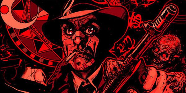
Steve Niles has built a solid name for himself in horror for his works 30 Days of Night, Criminal Macabre and Transfusion among many others in which he deals with zombies, vampires, Lovecraftian monsters and the occult. Tony Harris is an artist whose primary comic experience is working with DC and Marvel, but is stylistically much more complex, also working on commercials, films and television, and this book is a fantastic example of his extraordinary attention to detail. Set primarily in two locations – Egypt and Chicago – Chin Music requires some concentration but is definitely worth the effort.

The first five pages are completely devoid of narrative or dialogue, the only words the onomatopoeic scritches and scratches of Bill Tortolini’s careful lettering which gives each sound a specific font (really, it’s beautiful). Harris’s artwork feels so strange and surreal, mixing as it does photorealistic elements such as focus and reflecting dust particles with the heavily stylised and therefore cartoonish art deco elements of the room. The framing is subtle but effective at first, leading the eye down the page and through the story, and every panel has such exquisite detail (I will talk about this a lot). Over the next few pages we watch this detective at his desk, scratching occult symbols into the tip of a bullet, and his table. Any part of the page that isn’t filled with sequential imagery is filled up with floating symbols which work to frame the narrative, and these symbols seep into the framework. By having separate panels showing lifting the match, scratching it against the table, lifting the candle and then a combined but fragmented panel showing his lighting the cigarette and then lighting the candle, the action is given this slow, precise feel. Reddish eyes glow out from beneath his fedora and he stands slowly, raises the gun out of the door and shoots. The lasting focus of this scene is in his eyes, which are bulbous and a vibrant orange surrounded by a thin ring of purple.
Suddenly, we’re in Egypt. You can tell not just because of the setting and people, but because the panels change from art deco to an Ancient Egyptian style complete with snakes and symbols. A nice three-panel sequence shows a cloaked man, who appears to have helped someone, seeming melancholy. His eyes are that bulbous, wide orange and his nose is broad and mishapen as though broken. When a stranger walks into the tent, Harris includes again that slither of realism in streaks of light breaking through the curtains, but the slightly thicker-than-life features of the characters as well as the newcomer’s glowing red eyes keep the scene from drifting into illustration. The fight and chase scene which occurs next runs through colours, oranges and reds, and the artwork feels like classic Arabian Nights comics. It can be a little tricky to tell who is who, but the key is in the eyes. They dash through fragments of panels before the pursued attempts to fly upwards into the sky, although his chasers follow him up and tear the flesh from his bones with their bar hands before crashing past the face of a sphinx. Harris’ amazing attention to texture his shown wonderfully in the sequence above Egypt – the dessert is made up of so many tiny, detailed squiggles so as to create the grainy look of sand from a distance. They scratch patterns into the bones of what is now just a skeleton, calling him “Meddler”; covered still in blood mist they kick him into the dirt of the pyramids and leave him.
As the charred skeleton crawls across the dessert, the colour tone shifts slowly and subtle from the oranges and reds of Egypt to the purples and blues we saw so much of at the beginning of the book. A vehicle approaches and hits the skeleton; we can see that the driver is a kind person by his large, open eyes and his willingness to leap out to help. The bloody skeleton is speaking Egyptian, he doesn’t understand but he wants to help. I have to say that if I ran over a skeleton which was somehow still alive, I would not get out to investigate, but then I am not a woman of the law. He reaches out but the skeleton grabs his wrist hard, shouting in a language Officer Ness can’t understand. The framework leads the panel down as Ness spits out his cigarette, reaches into his pocket and brings out his badge which is highlighted in its own circular panel at the bottom. The only thing wrong with this follow-through is that you may miss that where the skeleton grabbed Ness’ arm is now bright orange/red. That can’t be good.
Ness calls for backup and follows the ambulance carrying the skeleton back to Chicago. None of them think he will make it (how could he?) but Ness wants to help the family, if he can’t help the victim. In a page we go from outside the city to the hospital, where they open the ambulance only to find it empty except for blood, everywhere.

The last section of the comic book takes a different tone, switching to a group of gangsters in a nice restaurant. The main man who appears to be talking is podgy and stout, with this shiny rose-cheeked look which reminds me of paintings of children. That odd touch of cartoonism works beautifully with a panel which moves in and out of focus; the people in the background are just grey ghost-like shapes and it’s easy to tell who is important. The gangster who is speaking, let’s assume he is the boss, has this incredibly contoured chubby face and the close up of a stubby cigar sticking out from his fat, soft lips make him seem completely unappealing. And the last page? Well obviously I won’t ruin it for you, but it’s a piece of art in and of itself.
It’s very unusual to begin a run of comic books with absolutely no narration; it’s not necessarily easy to tell what’s going on but since when has difficult meant bad? The only name we know so far is Ness the detective, but most other facts have been gained through the artwork which tells the story. It was a risky move definitely, but it seems as though Niles, who has proven himself as a writer, is allowing Tony Harris to take control of the direction and it seems to work. Sometimes it’s pleasant to read a comic which isn’t spoon-fed to you, and when you’re in the mood to linger over panels and appreciate detail, this is a great one to pick up. I definitely want to see what happens next.
Originally posted on the Travelling Man blog