travelling man

Thought Bubble 2014 Review

Thought Bubble 2014 Review

It’s the end of November and, once again, Thought Bubble was a roaring success. Perhaps no bigger than last year, it had some noticeable differences in organisation that went down both positively and negatively, depending on who you’d talk to.

The most obvious change was the introduction of the marquee in the centre of the convention space. Immediately, you’d think that this had increased the size of the convention, although comparatively it was probably about the same size as last year’s extra room. The advantages, however, were that a marquee is a lot easier to keep warm than the hollow bare-brick wall. Also using the central space for the major signings (people you knew would be busy, like Scott Snyder and Jock) meant that the New Dock Hall wasn’t completely full of seemingly endless queues. The downside to that was having to queue outside, in November. Still, you can’t have it all.

Fortunately the weather held and we barely saw a drizzle of rain – I expect there was great thanks from the cosplay crowd, of whom there were an incredible amount this year. I’m not sure how but it seems that every year I think I must have seen all of the costumes, until I see the post-con pictures and wonder how I could possibly have missed the adorable child in the jumpsuit with a Portal gun.
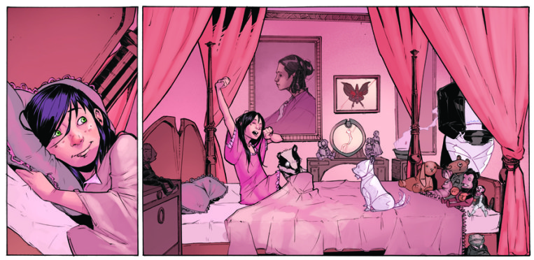
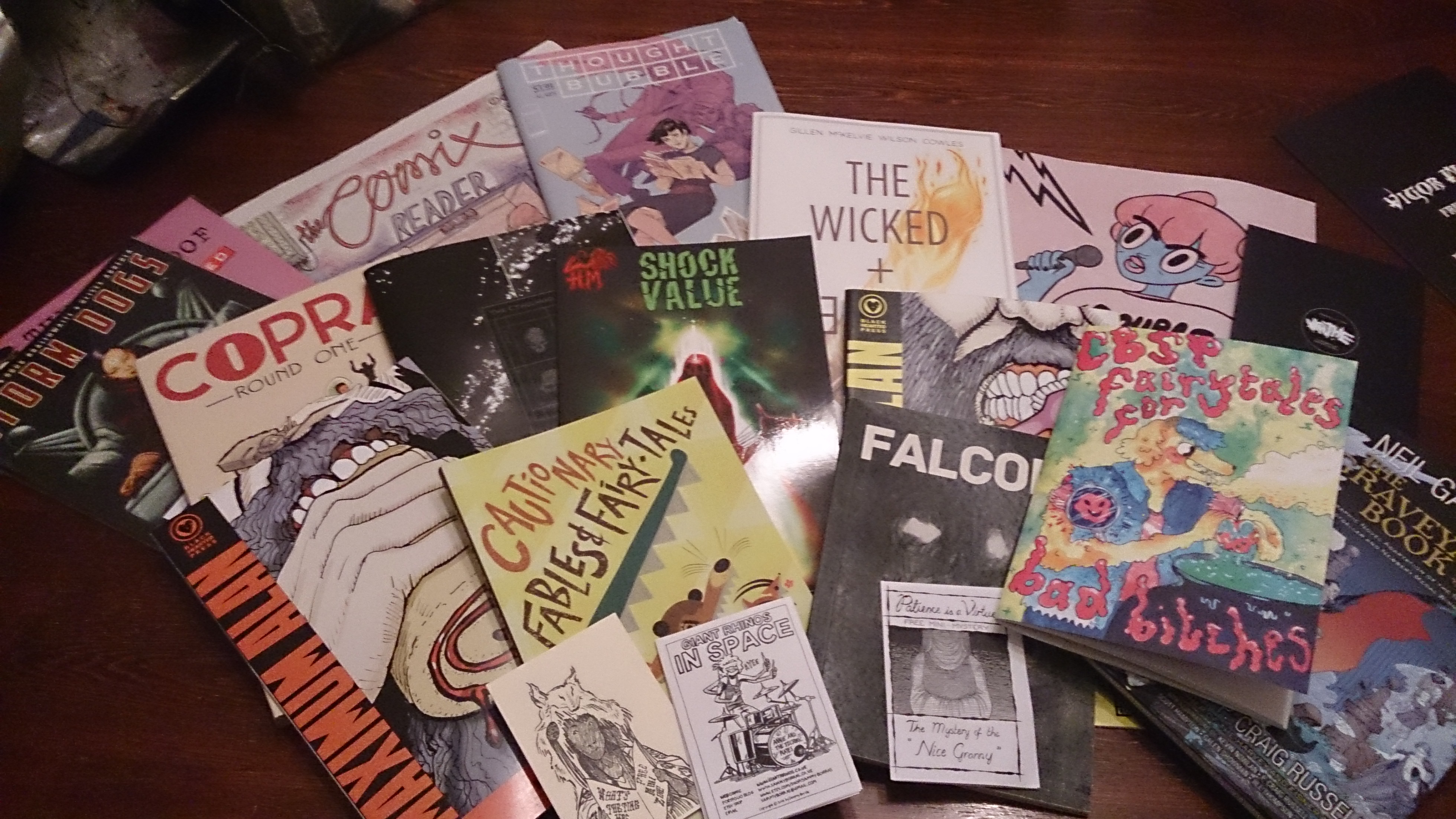
Post-Con Swag

Post-Con Swag

Other than that, it seemed like business as usual at the convention, which was great. There seemed to be a few things that fell through – the Diversity in Comics panel wasn’t racially diverse, for instance, but more on that later – although nothing ground to a halt. When you’ve been to Thought Bubble a few times you begin to see the patterns of exhibitors – you always know Dr Geoff is going to be there, and the Romantically Apocalyptic crew.

As a socially awkward person, I don’t always revel in being brought into conversations at exhibitor stalls, but I did have a few wonderful chats this year with independent artists. While not independent, my favourite talk was probably with David Hine, whom I queued for patiently to have Storm Dogs signed last year, but whose desk was virtually empty this year. We had a fantastic discussion about his book The Man Who Laughs, the origins of the Joker and the private life of Victor Hugo. These are some of my most treasured moments of Thought Bubble, when I can geek out on something that excites me with someone who’s managed to make something awesome.

The talks seemed hugely popular this year – several that I tried to attend in the Bury Theatre had snaked back to the door and then doubled in length again, and the line for the Gotham talk had been hopelessly long, which was a shame. The ones I did attend were pretty great though; the first of which was one of my favourites, The Best Thing I’ve Read All Year, which was alternatively dubbed “The White Bearded Man Panel” thanks to a few guests falling through. At least they were aware of it!

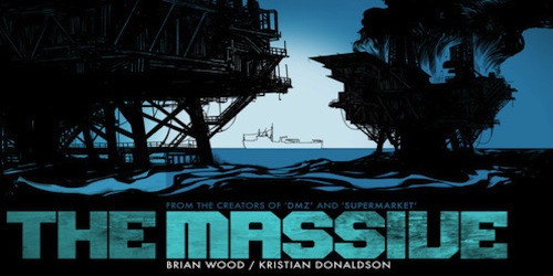
This is the best place to get recommendations, and I walked away with a whole bunch. Huge thanks go to Tom from Gosh Comics for recommending the Comic Book Slumber Party table, and specifically the Fairytales for Bad Bitches anthology which was read on the Saturday night and gratefully enjoyed. Supreme Blue Rose was another big push, and of course The Wicked and The Divine, which just won the British Comic Awards prestigious Best Comic award.

Other potential highlights – which have either been positioned on my radar or gone onto my Christmas list – included The Salt Lakes by Matt Taylor, a translation of three Japanese history comics for which I can’t remember the name, Beautiful Darkness, a new Stray Bullets, The Wrenchies and the upcoming Ody-C, z gender-swapped sci-fi version of the Odyssey which I cannot wait to get my grubby mitts on. I’m going to be poor for quite some time.

It was a good laugh of a talk though, and the suggestions were great. I was particularly pleased that riot grrrl comics were being actively promoted! The riot grrrl anthology is now sat on my bookshelf, screaming to be read. In time, my beauty!

For the second year of Diversity in Comics, there maybe could have been a bit more diversity – both from last year as well as in general. Howard Hardiman was in attendance again, the self-professed “gay cripple” who penned the excellent The Lengths which I snatched up last year after hearing him talk. I also noticed for the first time this year that he has a fantastic puzzle piece tattoo all over his lower arm – love it. He also showed a segment from one of his new books about a sleepy badger, where the titular badger comes across a black, disabled lesbian, which was a fantastic nod.

Unfortunately the panel was overwhelmingly white this year, largely because Barry Nugent hadn’t been able to come. He was fantastic at the talk last year but I couldn’t help thinking, with the increased amount of non-white exhibitors I’m beginning to see in the halls, they might have been able to get someone else. Donya Todd was charming though, and from my South-West neck of the woods, so I was pleased to find that I had already picked up her work in the riot grrrl anthology.

There were some great recommendations, including a seventies feminist publication called Spare Rib, and great women in comics like Suzy Varty, Trina Robbins and Eileen Crumb. We also discussed the problems when it comes to complaining about events like Thought Bubble and making them more accessible – I’d be curious to see if there are many negative reactions and how they are dealt with.

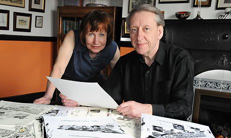
The Self Made Hero British graphic novelists talk was another great one, with the master of Cthulionic adaptations INJ Culbard joined by the creators of Ricky Rouse Has A Gun, which is another on my ever-growing Christmas list. I had already bought a series of grotesque cyberpunk postcards from John Aggs who describes Ricky Rouse as a “dumb book”, so was quite excited to see them talk about this piece that had been making waves for some time.

Finally, the only other panel I was able to make it to was the Journalism in Comics talk. The biggest topic of conversation was that of criticism, which was very interesting – we heard from Douglas Wolk, who prides himself on critical journalism, and Zainab who, like me, would rather be positive. Like her, I also shy away from giving negative reviews, being too aware that the subject could be reading it, although for someone in Douglas’s position this isn’t a luxury he can afford. I suppose it’s also about where you feel your responsibility lies – with the consumer, or with the creator of the work.

Again, the panel might have been a little better chosen. With only four panelists (including the moderator) it seemed out of place for one of them to barely do any comics journalism. Unfortunately music journalism doesn’t really translate as easily, and her comments – while insightful – felt out of context.

All in all, Thought Bubble still reigns supreme in the comic book festival circuit, especially as more and more conventions are going toward more mainstream media forms. Yes, Jason Momoa is very attractive, but comic book icon he is not – give me Tim Sale any day!

Finally, my weekend was made by meeting one of my personal heroes, Danielle Corsetto, and having her doodle in the copies of Adventure Time that I reviewed here and here.

So thank you once again Thought Bubble for the laughs, the inspiration, and the severely depleted bank account funds. I’m looking forward to next year already!


Posted by jenny in Comics, 0 comments
Serenity: Leaves on the Wind #1-3

Serenity: Leaves on the Wind #1-3

Fans of the famously cancelled series Firefly have reason to rejoice, as it’s back with a vengeance in comic book form.

If you’re unfamiliar with Firefly and Serenity then honestly, where have you been? When the series aired on Fox in 2002, sci-fi geeks found a new show to get passionate about, but as so frequently happens the network wasn’t nearly as interested. Its first airing had its time slot changed numerous times with the episodes not even shown in the right order, so it’s unsurprising that on-paper ratings made it look unpopular. Before all thirteen of the season’s episodes were released it was cancelled.


serenity group


After a huge petition including letters, adverts and conventions, Firefly was released on DVD and a few years later the film Serenity was made in an attempt to give the show’s fans a sense of closure. Today, both DVDs are a permanent fixture on the International Space Station, and despite nearly ten years without any chance of a film revival, the fandom is still going strong.


There have been other additions to the franchise, most notably in the comic book world where just recently the story has been added to again. Zack Whedon, brother of Joss and Jed, has taken control of the first canon Firefly story in some years, using the tried and tested technique that was used in the continuation of Buffy The Vampire Slayer through comic books, and the book is being illustrated by Georges Jeanty who became well known for working on the aforementioned Buffy comics. Joss Whedon has kindly offered his name as executive producer, although by all accounts he has mostly trusted his brother with running the show.


The comic begins eight months after the end of Serenity, and does an excellent job of skipping over what could be quite a lot of action in between. At the end of the film Wash was killed, Mal exposed The Alliance’s evil scheme, and River began to work out who she was, but as we all know a good story exists outside of the physical media, in the hearts of its fans. The intense fanbase of the show is a double-edged sword for the comic, as it comes with not just love but expectations, and a knowledge of the show which means if Whedon or Jeanty get even the slightest thing wrong, there will be some serious backlash.


Luckily, Serenity: Leaves On The Wind hasn’t failed to impress. The name is, of course, a tribute to Wash’s dying words in the movie but they end up meaning much more as the crew are now flying without aim, just trying not to get caught. Eight months after their world-shattering announcement, Jayne has left the crew of Serenity, a widowed Zoe is pregnant and Inara is finally in a relationship with Mal after being blacklisted by the Companion’s Guild. River has picked up the co-pilot’s controls and loves the ship as completely as Wash ever did. It feels seamless, like we haven’t left the show at all – nothing about the characters’ actions, words, circumstances and feelings has been altered, and it’s exquisite. By the third issue however, we start to see that constant peril is beginning to have an effect on the crew, especially the once innocent Kaylee.


Kaylee may have found her dark side.

Kaylee may have found her dark side.


After illustrating for the Buffy series, I’m impressed that Georges Jeanty went for another comic book based on a TV show, which comes with great expectations for how the characters appear. It isn’t always spot on and at a few moments in the first three issues I wasn’t sure who a character was meant to be, but the giveaways are the facial expressions, which are surprisingly close to the actors’. If you look at Jeanty’s influences – Mobius, Geof Darrow, Walt Simonson – you can see that he is inclined toward a folksy style of art which works beautifully with the rustic space-opera of Firefly. If anything, the ship itself was probably more difficult to render as it is a character in its own right with a very distinctive style.


Like any large governmental organisation, The Alliance aren’t about to just give up because they’ve been exposed, and as River comes to believe that there may be more like her the story continues in a believable way. But rather than just extending the chase, Zack Whedon has introduced a new character to the team: Bea, the idealist current leader of “the New Resistance” who views Mal as nothing short of a hero, should provide a much needed dose of youth, optimism and political passion. While we’ll almost certainly see these traits beaten out of her – the ‘Verse is not a kind place – she may be just what the team needs.


Did I mention Jubal Early's back?

Did I mention Jubal Early’s back?


Beginning in January, three issues of Leaves on the Wind have been released so far and are everything a Firefly fan might want from the series; namely a continuation of the story. While other Firefly comic book series have aimed to provide back stories, Leaves on the Wind looks to the complex future of Serenity’s crew in a world where they aren’t just outlaws, but both revolutionary heroes and wanted terrorists at one time. For fans of Firefly, reading this comic series is a necessity.

Originally posted on the Travelling Man blog where I and others write reviews!

Posted by jenny in Comics, 0 comments
Junji Ito’s Uzumaki

Junji Ito’s Uzumaki

Some horror stories stick with you for days; while reading you can’t tear your eyes away and later on images persist when you’re trying to get to sleep. When I was six or so, I remember being so terrified of the Goosebumps book The Haunted Mask that I put it on the floor of my room with a plastic table turned upside down on it. When I read Lunar Park by Bret Easton Ellis as a teenager, I reached a terrifying point and knew I had to keep reading or I wouldn’t be able to sleep. I ended up finishing it at 5am without experiencing a moment when I wasn’t afraid.

This book was the subject of many nightmares for me.

So when I took Uzumaki to read on the train, I was pleasantly surprised to find I couldn’t stop staring in horror at the pages. The most direct translation of the word “Uzumaki” is “Spiral”, although it refers more to a three-dimensional spiral, like a vortex or a whirlpool and just like the secret shape of the universe, Uzumaki draws the reader helplessly in. The deluxe edition was printed in 2013, and stands out on the Travelling Man shelves as a rather imposing beast – matte black on the front and back with faint images from the story while the two inch thick spine shows a wide-eyed and stitched together corpse.

20140222_172056

The horror manga, written and illustrated by Junji Ito, was first serialised in Shogakukan’s Big Comic Spirits in the late nineties, a magazine designed for young adult men. It was later published in Viz in England, re-released in 2007 and last year had its omnibus hardcover deluxe edition. Ito is most famous for his manga Tomie, about an immortal girl who drives the people around her into an obsession so fierce they end up killing her, but also wrote Gyo, the story of mechanical sea-life carcasses controlled by a “death stench”. Some popular themes in his work include body horror, breakdowns of society and the inability to escape one’s fate.

The horror builds up slowly and insidiously in the isolated coastal town of Kurôzu-cho. Most of the stories are focussed around a young girl Kirie and her boyfriend Shuichi, who goes to school in another town. When Shuichi’s father first becomes obsessed with the spiral, it’s destructive but it’s all in his mind. He begins seeing them everywhere, in many patterns, but it’s much more terrifying when his wife starts to notice spirals on her own body and on others; determined to eradicate the pattern which haunts her, she cuts the tips from her fingers, shaves her hair off, and eventually becomes her own undoing when the image of her dead husband as a millipede tells her about the spiral in her ear. The moment Shuichi sees the organ of Corti on a medical poster this feeling of intense dread descends and we know it’s only a matter of time. The ironic tragedy of it? That by damaging her inner-ears, she is trapped forever in the spiral of vertigo.

20140222_171915

Moments in this book go from genuinely tragic, to hilarious, to disgusting almost instantly. As the town begins to succumb to the spirals, so to do the residents, some of whom begin to transform into gigantic snails and lose their humanity – it’s a Kafka-inspired piece of body horror which is absolute perfection down to the way he draws the skeletal snail-humans’ faces. When the townspeople become trapped and begin to run out of food, they see the snails as a preferable alternative to outright cannibalism.


The spiral is impressively doled out throughout the story – it begins to appear more and more in the background, not just in spiraling clouds but in wood patterns, hair styles, umbilical cords, sirens and whirlwinds. The way the stories build up slowly gives it the same kind of feeling as MPD Psycho or the X-Files TV series, starting as monster-of-the-week style storyline which evolve into a huge story. It gives the reader a sense of inescapable horror; we keep falling deeper and deeper into the spiral, unable to look away and unable to change the end of the nightmare.

20140222_171703

The actual town of Kurôzu-cho is comparable to Buffy’s Sunnydale, where so much of the supernatural is able to happen before people will believe something mysterious is going on. Kirie and Shuichi are in the privileged position of knowing what’s going on before anyone else, but are still unable to escape in time because of the pull of their friends and family, so we watch them fight off the terror with knowledge for a while. Kirie and Shuchi’s relationship is one of those pure manga loves, like that seen among the young couples in Battle Royale; that kind of unquestionable love and commitment that keeps them together until the end.

I could go on for hours about the various horror elements – it’s a big manga, with a lot of dark stories packed in. It’s sometimes ridiculous, usually surreal and in terms of artistic style it’s like a combination between Akira, Pet Shop of Horrors and an M.C. Escher piece, with a really astounding amount of detail and texture. The first few pages of most chapters are coloured in a simplistic watercolour style of paint which is incongruous with the charcoal blacks of the rest of the book; it’s kind of pleasantly jarring, if such a thing exists, and the girls have this wonderful Mark Ryden doe-eyed appearance.

20140222_172155

I would recommend Uzumaki to lovers of body-horror, chilling manga, Lovecraftian and Kaska-esque stories, and a slow-burning apocalypse. If you haven’t explored much manga this is a great place to start, but otherwise there is a very decent film version – albeit with a much shorter storyline and drastically different ending.

Pleasant dreams!

Posted by jenny in Comics, 0 comments
A Thought Bubble Convention Review

A Thought Bubble Convention Review

Thought Bubble’s comic convention just keeps getting bigger and better every year. Not that I haven’t enjoyed every year I’ve been to the convention, which is four now, but this year’s convention was well-run, easy to navigate and seemed to grow and adapt to the needs of its visitors.

On the Saturday, I was lucky enough to get a few signatures from some of my favourite artists and writers. First of all, Cameron Stewart signed my copy of Sin Titulo (which I reviewed a while ago for Travelling Man) which was lovely; then a half hour queue lead me to Matt Fraction who signed my Hawkeye graphic novel (review) and first issue of Sex Criminals (just you wait until my review of this!). When I told Matt that I thought Sex Criminals was important, and would go down in history he sniggered at “go down”. Wonderful. I also had The Wake issue 1 signed by Sean Gordon Murphy who was kind enough to talk to me for a while on the Sunday: that interview will be up soon.

Then came the panels. First up was Image Comic’s Independence in the UK panel, which actually only had one third British panelists, but ah well. I always like the independence talk, it’s exciting to hear creators talking about being given the freedom to do their own work, which invariably ends up criticising Marvel and DC’s attitude toward the artists and writers. This made it much more strange when the next panel came out – the Marvel talk, which was obviously designed to big up the publishing house. It was absolutely hilarious though – the constant abuse of Jamie McKelvie from Kieron Gillen, David Aja finding it near impossible not to swear, and the dynamic married duo of Matt Fraction and Kelly Sue Deconnick. If comic conventions had Kings and Queens like proms, it would definitely have been them this year.

For Sunday, I kicked off the convention with the Diversity in Comics panel which was incredibly inspiring. One of my favourite speakers was Howard Hardiman, a self-proclaimed “queer cripple” with a fantastic sense of humour; after the panel I went to find his table, had a really interesting conversation with him about gender in Greek and Roman times and he signed a copy of The Lengths for me. I read the book on the train home and absolutely loved it; really brutal but touching. A review may come. I also really enjoyed hearing from Fiona Stephenson who has a very unique perspective, being a feminist comic veteran who now deals in stereotypical aesthetics of female beauty. Everyone else was fantastic too, of course.

The biggest change for me going into the weekend was the conversion of Women in Comics to Diversity in Comics. Traditionally, Women in Comics was my highlight of the weekend – a group of intelligent and inspirational women discussing one of my favourite topics – so I wasn’t sure how this change would go. But I have to say that it was a massive improvement. While I loved the old panel, after three visits it was beginning to feel like it maybe wasn’t making any forward progress; and to be perfectly honest, it’s become so much more even in terms of gender at cons. That’s why it was great to open the debate to other issues like sexuality, disabilities and race, because these are the areas which are truly still minorities in the mainstream comics fan world. When an issue is personal to you as feminism is to me, it’s easy to care about it but it’s important to care about other people who have problems you don’t know and don’t understand, and I walked out of the Diversity in Comics panel feeling hopeful for the future.

The other significant improvement that I appreciated was the streamlining of the buildings. The addition of the Allied London Hall meant that a proper exploration of the festival took two days, and it was nice to have an unfamiliar spot to wander around in. Although I didn’t go into Bub’s Lounge, I heard it was lovely and chilled out in there, and the temporary Cafe solved delicious pastries and coffee! Which was good because Tesco had run out of sandwiches by 2pm on the Saturday. And while the extra panel area was a little cold, it was nicer than having to go to the top floor of the casino (however lovely those rooms were) and helped the whole event feel much more seamless.

And finally, some of the best goodies I picked up over the weekend (on my severely limited budget).

  1. The Lengths. As I said, it’s a great book and meeting Howard was lovely
  2. Briar, a free comic being handed out from the same team as Porcelain: A Gothic Fairytale (my review here)
  3. A beautiful sterling silver clockwork earring with its own origin story in comic form!
  4. A lovely brown card A3 print, I believe the artist is Kate Mia White although I may be wrong. Incredibly intricate pen work.

And more…I’m sure! I haven’t made it through all of my finds from the weekend yet.

Posted by jenny in Comics, 0 comments
Lazarus issues #1 and #2

Lazarus issues #1 and #2

My first introduction to Greg Rucka’s writing was in the Batwoman reboot. I lapped it up, being a huge fan of the Batman mythology and also a big fan of strong women. I looked more and more into Rucka, and found that this was a common theme of his. So of course when I saw the cover of Lazarus issue one – the dark, furious woman with a bullethole in her head, I was intrigued. The second issue drew me in further, showing Forever strolling down a desert highway toward the viewer with gun raised and sword drawn behind her. She looks like a less-sexualised Lara Croft: wearing sensible black military clothes, utility belt and pony tail flying in the wind, she’s certainly attractive but more importantly she’s athletic. Going through the pages, it’s clear that Forever has been modelled after athletes, with an appropriate body to match. But we’ll get to that later.

The first issue has just a few words which explain the state of the world. In the future, all power is related to wealth and the few “Families” who own that wealth rule the citizens they deem useful to them; anyone without a registered allegiance is considered Waste, and left to fend for themselves. Each family has a Lazarus, a member of the Family who has been given all the scientific and medical advances possible in order to protect the interests of that Family. In an interview, Rucka described the Lazarus as the “bloody sword and iron shield of the Family”, and explained that the Lazarus is not immortal, just capable of recovering from injuries no ordinary human could thanks to a level of science nearly indistinguishable from magic. This isn’t a spoiler by the way, as the first few pages show a clinical examination of Forever dying from serious wounds.

The attack is narrated in a medical and forensic way, detailing each wound and its effect. It becomes apparent when her eyes open and she goes after the men; this whole scene has a cold blue feel but when she finds the men and uses her superior fighting skills and strength, their deaths are highlighted in a backgroundless pink/purple hue that feels something like a film effect where a person’s life is drained out of them. Back in the sterile green doctor’s office, she confides in him that she feels bad about killing the men as they only wanted food. Already we get into the class issues of the comic, and Forever’s internal struggle to be okay with what everyone else in her Family believes it right. The doctor betrays her confidence immediately, contacting her brother Jonah and warning him that she needs to feel some positive reinforcement – that somebody loves her. He unwillingly agrees.

The concept is interesting already. Unlike many dystopian futures told by the rebel or the underdog, Forever is one of the elite. More than that, she’s a product of the elite, charged with protecting everything her Family deem important but in some ways more human than them. There are clear differences between Forever and Jonah. She’s dressed entirely in military gear, he’s in a dark suit with his hair slicked back. She looks positively confused that he hugs her. He explains that there was a raid on the compound by one of the other families, the Morrays, and that it must have been an inside job. When Jonah calls in all of the staff who could have done it, he threatens to kill them all and their families if no one confesses; when someone does, she’s almost certain he isn’t guilty, but has to kill him anyway. Before she kills him, she tells him she’ll tell his daughter he loves her – he says that she knows, a little kicker about what love and family really are.

At the end of the first issue, she’s telling the doctor she feels fine. The father of the Carlyle Family, Malcom, has brought his children together to discuss the Morray matter. This is a great way to see the different elements of the Family: the coniving Jonah, who appears to be having an affair with his twin sister Joannah (very Game of Thrones), who is absent from the meeting, the calmer but more timid Stephen, and the older sister Beth who treats Forever like a test subject. The Father dismisses Forever as “The Lazarus” behind her back, but treats her like his favourite daughter when with her; it’s obvious he is manipulating her using affection.

While Malcom speaks to Forever, the rest of the siblings fight about her in the kitchen. It becomes obvious that she’s not Malcom’s real daughter, suggesting that she was created specially for the family, but Beth goes wild at the suggestion of Forever finding out, knowing that they might lose control of her. Malcom’s splitting the kids up again, and Forever is to accompany Jonah back to Los Angeles, his own domain. The scenes of them travelling to the city which has been wrecked by earthquake show the distinct contrast between these elites in their armoured car escort drinking champagne while some kind of slum unveils behind them. “No point wasting resources on Waste who can’t appreciate it”, comments her brother.

https://i0.wp.com/d1vr6n66ssr06c.cloudfront.net/wp-content/uploads/2013/08/Lazarus.jpg?resize=640%2C330

 As she walks through the dystopian city, Jonah’s tail Mason stalks behind her, seemingly hidden. She approaches some playing children, hands them a note and walks around the corner; of course he runs after her, taking the note from the children but rounding the corner to find a dead end. He opens the paper: “If you keep following me, I’m going to kill you.” I certainly wouldn’t mess with her. The last we see of Forever is out in the desert preparing to talk to the Morray Family, but they surround her and take her prisoner. I absolutely cannot wait to see what happens next – Rucka’s commented that she and the Morray Lazarus will get on much better than you might think, and (this is just my speculation) maybe she’ll learn something about another Family’s ways which will help her to answer some of the questions her own aren’t prepared to deal with.

The character design of Forever is clearly detailed; she looks consistent panel to panel, and I don’t think we’ve seen her crack a smile once. As I mentioned earlier, they clearly put a lot of thought into how a woman would be created for such a purpose; very tall, muscular, a large ribcage to support athletic levels of breathing. And yeah, she is good-looking, but such a vain family wouldn’t have created an ugly member, and at least she’s not a cartwheeling blonde schoolgirl. When the project was first announced, she was named Endeavour, but while Forever has a similar meaning it can also be shortened to Eve, perhaps suggesting that she has the capability to change the world.

The dystopian future that Lazarus is set in was inspired by the economic environment of the world today and the Occupy movement, with the central concern being, what if things don’t get better? Like most good science fiction, it’s a social allegory, and Forever seems to represent the conflicting values of family pride/nationalism with genuine concern for other human beings. The colouring is subtle, usually consisting of pages bathed in a certain shade for different areas, and the facial expressions are exquisite, courtesy of Michael Lark. Interestingly, the mother of the Family is being kept back for now, and it really feels like Rucka and Lark are after a long run with Terminator Forever; their previous collaboration Gotham Central was a huge success for them both and they were critically acclaimed as a great partnership; with the relative freedom of Image Comics, I hope this partnership endures and we learn more about this horrible world and the heroine that you’re sure to care for by the end of the second issues.

Originally posted on the Travelling Man blog

Posted by jenny in Comics, 0 comments
Chin Music #1

Chin Music #1

Steve Niles has built a solid name for himself in horror for his works 30 Days of Night, Criminal Macabre and Transfusion among many others in which he deals with zombies, vampires, Lovecraftian monsters and the occult. Tony Harris is an artist whose primary comic experience is working with DC and Marvel, but is stylistically much more complex, also working on commercials, films and television, and this book is a fantastic example of his extraordinary attention to detail. Set primarily in two locations – Egypt and Chicago – Chin Music requires some concentration but is definitely worth the effort.


chin1

The first five pages are completely devoid of narrative or dialogue, the only words the onomatopoeic scritches and scratches of Bill Tortolini’s careful lettering which gives each sound a specific font (really, it’s beautiful). Harris’s artwork feels so strange and surreal, mixing as it does photorealistic elements such as focus and reflecting dust particles with the heavily stylised and therefore cartoonish art deco elements of the room. The framing is subtle but effective at first, leading the eye down the page and through the story, and every panel has such exquisite detail (I will talk about this a lot). Over the next few pages we watch this detective at his desk, scratching occult symbols into the tip of a bullet, and his table. Any part of the page that isn’t filled with sequential imagery is filled up with floating symbols which work to frame the narrative, and these symbols seep into the framework. By having separate panels showing lifting the match, scratching it against the table, lifting the candle and then a combined but fragmented panel showing his lighting the cigarette and then lighting the candle, the action is given this slow, precise feel. Reddish eyes glow out from beneath his fedora and he stands slowly, raises the gun out of the door and shoots. The lasting focus of this scene is in his eyes, which are bulbous and a vibrant orange surrounded by a thin ring of purple.

Suddenly, we’re in Egypt. You can tell not just because of the setting and people, but because the panels change from art deco to an Ancient Egyptian style complete with snakes and symbols. A nice three-panel sequence shows a cloaked man, who appears to have helped someone, seeming melancholy. His eyes are that bulbous, wide orange and his nose is broad and mishapen as though broken. When a stranger walks into the tent, Harris includes again that slither of realism in streaks of light breaking through the curtains, but the slightly thicker-than-life features of the characters as well as the newcomer’s glowing red eyes keep the scene from drifting into illustration. The fight and chase scene which occurs next runs through colours, oranges and reds, and the artwork feels like classic Arabian Nights comics. It can be a little tricky to tell who is who, but the key is in the eyes. They dash through fragments of panels before the pursued attempts to fly upwards into the sky, although his chasers follow him up and tear the flesh from his bones with their bar hands before crashing past the face of a sphinx. Harris’ amazing attention to texture his shown wonderfully in the sequence above Egypt – the dessert is made up of so many tiny, detailed squiggles so as to create the grainy look of sand from a distance. They scratch patterns into the bones of what is now just a skeleton, calling him “Meddler”; covered still in blood mist they kick him into the dirt of the pyramids and leave him.

As the charred skeleton crawls across the dessert, the colour tone shifts slowly and subtle from the oranges and reds of Egypt to the purples and blues we saw so much of at the beginning of the book. A vehicle approaches and hits the skeleton; we can see that the driver is a kind person by his large, open eyes and his willingness to leap out to help. The bloody skeleton is speaking Egyptian, he doesn’t understand but he wants to help. I have to say that if I ran over a skeleton which was somehow still alive, I would not get out to investigate, but then I am not a woman of the law. He reaches out but the skeleton grabs his wrist hard, shouting in a language Officer Ness can’t understand. The framework leads the panel down as Ness spits out his cigarette, reaches into his pocket and brings out his badge which is highlighted in its own circular panel at the bottom. The only thing wrong with this follow-through is that you may miss that where the skeleton grabbed Ness’ arm is now bright orange/red. That can’t be good.

Ness calls for backup and follows the ambulance carrying the skeleton back to Chicago. None of them think he will make it (how could he?) but Ness wants to help the family, if he can’t help the victim. In a page we go from outside the city to the hospital, where they open the ambulance only to find it empty except for blood, everywhere.


The last section of the comic book takes a different tone, switching to a group of gangsters in a nice restaurant. The main man who appears to be talking is podgy and stout, with this shiny rose-cheeked look which reminds me of paintings of children. That odd touch of cartoonism works beautifully with a panel which moves in and out of focus; the people in the background are just grey ghost-like shapes and it’s easy to tell who is important. The gangster who is speaking, let’s assume he is the boss, has this incredibly contoured chubby face and the close up of a stubby cigar sticking out from his fat, soft lips make him seem completely unappealing. And the last page? Well obviously I won’t ruin it for you, but it’s a piece of art in and of itself.

It’s very unusual to begin a run of comic books with absolutely no narration; it’s not necessarily easy to tell what’s going on but since when has difficult meant bad? The only name we know so far is Ness the detective, but most other facts have been gained through the artwork which tells the story. It was a risky move definitely, but it seems as though Niles, who has proven himself as a writer, is allowing Tony Harris to take control of the direction and it seems to work. Sometimes it’s pleasant to read a comic which isn’t spoon-fed to you, and when you’re in the mood to linger over panels and appreciate detail, this is a great one to pick up. I definitely want to see what happens next.


Originally posted on the Travelling Man blog

Posted by jenny in Comics, 0 comments
Twelve Reasons to Die – Ghostface Killah

Twelve Reasons to Die – Ghostface Killah

If you’ve read many of my reviews, you might have noticed that I have a particular fondness for multi-media stories and thematic pieces of art – so it’s no wonder really that I would enjoy Ghostface Killah’s new comic book Twelve Reasons to Die, a collaboration with Adrian Younge designed as an accompaniment to his newest album of the same name. With both the album and the comic executive produced by RZA and produced by Adrian Younge, GFK manages to pull together pieces of crime fiction, horror, soul and the supernatural to create the story of a vengeful spirit taking down the twelve mob bosses of Italy. The first ever release from Black Mask Studios, created by the man who has been described as a “compulsive storyteller”, Twelve Reasons to Die is an ambitious project, only for mature readers who are not easily offended. You have been warned.


The first issue actually contains four stories which are woven together, with the largest portion of the book dedicated to the story of how the 12 Delucas formed out of a mutual interest in increasing the quality of crime in Italy. In a series of Polaroid-style flash-backs, Mussolini’s influence on the crime families of Italy is spread out before us in scenes of violence, rape and war, but out of this come the twelve men who act with honour. The irregularity of the panels takes us smoothly through the evolution of the crime syndicates, with each mob boss driven by different motivating factors. Bodies dripping with blood are subtly placed in the trunk of cars as civilians walk by, no one paying any attention to the horror and with a seeming smile on everyone’s face. A ten-panel double page spread spells out the highs and lows of power that crime brings, and how easy it is to abuse that power; it’s obvious that things are far too easy for these men who are not as honourable as they think.

In a night club, a mysterious woman reports to an unknown companion that the twelve members have arrived and it’s obvious that the men are about to be in some trouble. In walks this new gangster – who bears a striking resemblance to GFK himself – and with only the words “Evening fellas” promptly destroys the 12 Delucas in some incredibly brutal ways. The narration reveals that they never had a chance, that they were only soldiers but Anthony Starks was a weapon. Fans of Ghostface Killah will most likely know that he has previously adopted the monikers Tony Starks and Ironman (with vital spelling differences), therefore it’s perhaps unsurprising that he appears as his comic book alter-ego.

The other stories, which are flashbacks and connected to the story in various ways, deal with terrifying sheep, a haunted record collection and an incident of death by bees. This first issue is a really interesting mixed bag and feels like a huge teaser for the rest of the run, setting up some interesting plot devices in this supernatural giallo work. Written by Matthew Rosenberg and Patrick Kindlon, the idea to bring in a rotating team of some twenty artists (from the little-known to the well-loved) is an inspired idea which echoes the collaborative ethos of Wu-Tang Clan and ensures that the comic is not defined by just one artist’s style. Dave Murdoch’s transition splash page which shows the vengeful entity Ghostface Killah is a beautiful piece of work and while it took me a moment to adjust to the rapid shifting of artistic style it should be really effective over the series. The colouring from Jean-Paul Csuka varies from blood-drenched reds, to pastel auction-houses, to soul-inspired pink and blue pop-art – the abrupt changes add to the frenzy of this comic, and a shout-out has to go to the smooth lettering of Frank Barbiere.


The album Twelve Reasons to Die is available on CD, vinyl and cassette as well as digital, and subscriptions for the comic book can be found in the Black Mask store. The movie-style advertisements show the influence of European B-movies and 70s psychedelic soul on the story.

Posted by jenny in Comics, Music, 0 comments
An Interview with Scott C

An Interview with Scott C

The charming Scott C, writer and artist of comic books, children’s books and art director of video games, was kind enough to talk to me about his influences, happiness, and what’s coming next.
Scott C - spidermans-copy
Who were your biggest drawing influences?
Early on, artists like Richard Scarry, Maurice Sendak, Norman Rockwell, and Heronimous Bosch.  Later on, Lane Smith, J. Otto Seibold, Shag, and Jim Flora. But through the years my influences change as i am exposed to new art and new friends!  My friend Paul Allan had probably the biggest influence on my style after college.
What are your favourite themes to draw?
i enjoy good vibes.  happy characters.  having a good time with one another.  so my paintings often include happy things.  but i do also enjoy uncomfortable moments and pensive moments.  this could come in the form of a mummy contemplating alone on a rock or a knight lying on top of his freshly slayed dragon wondering why he must always do battle and slay things.
If you could illustrate for any author, living or dead, who would you pick?
Ray Bradbury.  I would just love to work with that guy so much.  His stories are my favorite and he seems like a pretty happy and inspired dude.  we’d probably create some nice things together.
You transitioned from games to comic books – was that very different?
Well, i’ve been doing comics alongside my game career, so it has been a sort of compliment to the games.  As the video games became more gruesome, as they did in Brutal Legend, my paintings and comics became cuter.  Working on a game for 5 years, one often needs a break and creating comics was a welcome change of pace.  The Double Fine Action Comics were done as a warm up each morning before getting to work on Psychonauts, our first game.  Really comics are a quicker fix than video games, but creating stories and characters can be equally as satisfying.
How much control did you have in games like Psychonauts and Brutal Legend?
It isn’t so much about control when you’ve got so many talented people working together with like minds.  i was art director on Psychonauts and worked very hard on that game establishing the style and maintaining it throughout, but Tim Schafer had the final say.  and luckily he has amazing taste!  He is the best.  I loved working with him.  Brutal Legend, i oversaw the preproduction phase which was the inspiration stage, getting everyone excited to create this new world.  Lee Petty was at the helm of the production.  But it was a very collaborative process.  everyone had amazing ideas and sometimes i was there to make a decision if one needed to be made, but mostly i was just into getting everyone pumped.
Do you have any advice for artists to break into video games or comic books?
i would say, keep making things on your own!  i got my start in comics by just making mini comics with my friends and going to comic shows. Later i began posting comics online and tumblr.  The online community is an exciting thing to be a part of.  Video games have changed quite a lot since i started in the 90′s.  i would say get versatile in what you can do and try interning first or getting a job at a very small company where you can get real experience.  or just make you own little games with your friends!  that is the best proof that you can do it.
From your book Great Showdowns, which is your favourite Showdown?
Ghost.  I always say Ghost.  Because it is just so silly.  Demi Moore and Patrick Swayze versus the little clay pot dude on the pottery wheel.  Such a happy and sexy moment.
What’s coming up for you?
Well, ONI Press is releasing the second volume and reprint of the first volume of the Double Fine Action Comics.  Should be any day now, unless it is already in stores.  And my third children’s picture book comes out in the Fall called If Dogs Run Free, a story by Bob Dylan, the songwriter that we are all familiar with.  The second collection of the Great Showdowns comes out in the Fall as well. And i am currently working on writing and illustrating my first picture book all on my own!  It is about Hugs.
Let’s talk pipe dreams. If you could do ANYTHING with your career now, what would you do?
Probably make some movies.  I like movies.
Posted by jenny in Comics, 0 comments
Jupiter’s Legacy #1

Jupiter’s Legacy #1

The first collaboration in ten years of the writer and artist behind The Authority, Jupiter’s Legacy has been promoted by Mark Millar as the big superhero hit of 2013, and a love letter to America. It’s easy to make comparisons between Jupiter’s Legacy and other post-modern superhero comics such as Watchmen and Millar’s own Kick-Ass; like Watchmen, Jupiter’s Legacy tells the story of Depression-era superheroes who have fought the best of the fights, and led their children into a completely different world, in a career they never asked for. It’s a story we’ve heard before but not for some time, and the present-day setting is completely in the now; like celebrities of today, the superheroes’ children thrive on apathy and stardom.


The story starts out in 1932 with a crew of young and hopeful individuals following a Clark Kent-looking hero and his dream of an island that will save America. Sheldon lost everything in the Wall Street crash but was more upset by the people who were less fortunate than him and driven to breadlines and soup kitchens. The dream of the island so held him that his fiancee left him, and he travelled across the world with a trusted group of colleagues including his brother. The background is done succinctly and the character design by Quitely (All-Star Superman) is exquisite, each character given their own personality, eye shape, even the specific ways they are stood or sat belie elements of their personalities. Sheldon’s brother Walter hangs toward the back while the beautiful, delicate-featured Grace stands firmly behind Sheldon. They find the island of course, just as he saw it, and have never talked about what happened – we aren’t let in on that either yet. All we know is that they returned to the USA with costumes and superpowers and made the world a better place. The faded grey and brown wash fades out and bursts back into the bright lights of 2013, and the resulting children of those original heroes.


Drenched in red, white and blue, Chloe is wearing what might liberally be described as skimpy sportswear, a baby pink ensemble with hot-pants so small her pants show from underneath and heeled boots up to her thighs. The childish nature of her outfit, looking like an overtly-sexualised ideal of youth and beauty, seems like a deliberate comment about the ever-younger celebrities which are exposed and fetishised in contemporary culture. Her brother makes a stark contrast in all black with a carefully unkempt look to match his offensively dismissive attitude as he mocks his sister and abuses the superhero groupies who throw themselves at him. This guy clearly has never wanted for anything, and can get away with whatever he wants; he seems like a real jerk. But he makes a point about how there are no great super-villains to fight any more, that his parents lived in the Golden Age of superheroes and that things are not the same any more.


In Vermont, of course an epic fight is underway. The hill landscape hosts a discussion between two of the younger heroes who are unwilling to get into a scrap with villain with an anti-matter battery in his chest when the fight crashes down right next to them. Sheldon’s outfit is very similar to Superman’s, featuring blue and a red cape, although the distinctive symbol on many of their costumes shows an eagle with a halo, which is as yet unexplained. As all the superheroes crowd in and the villain Blackstar strikes back, Walter uses his mind powers to take Blackstar’s mind away from his body. It’s an incredibly interesting series of images, as Walter claims that he has recreated a holiday from his childhood but the landscape and colour tones of the dream world echo those of the real world in which Blackstar is being battered to death. It’s a tranquil dream, Walter hovering about and sharing cake while Blackstar adjusts to knowledge that he’s being killed and there is nothing he can do about it. It’s difficult to tell if Walter is being kind or sadistic in describing the detail of Blackstar’s death, but the job works, and while the heroes have defeated a dangerous villain, it has been most unheroic and they plunge straight into arguing about their mission and the constant failure of their children to follow in their footsteps.


The responsibility of power is a classic superhero concept, and in this scene Sheldon and Walter argue about what they should be doing to make the world a better place; while Walter feels that the system is broken and they are the ones with the ability to fix it, Sheldon feels that they should serve the elected officials in charge, despite the trouble they have gotten the country in. Walter can see patterns in society he saw in 1929 and is scared for the future, but Sheldon will not give in to his dissent.


At 4am in Los Angeles, a familiar baby-pink bum walks into a glorious living room, complaining that her mother wants her to fight despite being a Buddhist and a vegetarian. Her unsympathetic friends in lurid costumes look like cyberpunk fashionistas play their tiny violins and offer her some space blow to take away her troubles. It’s clear from Chloe’s ranting that she has some serious body and drug issues, even comparing her feet in a negative light to her mother’s. Being brought up by a couple who are so happy they never argue sets a high bar for a girl to grow up to, and Chloe doesn’t think she can do it. It’s sad, and an interesting statement on both celebrity status and the state of modern superhero comics compared to old; the old age of superheroes has gone, taking the last of the villains with them, and their children are left with powers and nothing to fight. Instead they turn their lives to stardom; at least Chloe uses her profile for charity work, even if it is superficial and calculated, as her brother thinks. But what obviously consumes Brandon and Chloe is a jealousy of their parents who did great things with their lives but don’t understand that t the world has changed. It’s not enough to be good at what you do anymore, there is a certain requirement to be sexy and young and interesting.


The comic ends with Chloe collapsing into the living room table, lying spread-eagled among the glass like a broken puppet. Quitely’s artwork, and the subtle colouring by Peter Doherty show this vulnerable girl prone on the floor, helpless and dressed in childish clothes, which can be quite hard to see. The artwork in Jupiter’s Legacy is one of its biggest draws for me; each person comes with a distinct personality that we can see in the way they move and the subtle face-changes they make. This issue has received some negativity, saying that it rehashes old ideas, but while Millar obviously has specific themes he enjoys addressing, he attacks them all in completely individual ways, and while the modern-day superhero element might seem like something from Kick-Ass, there is much less of Millar’s anger and barbed language and seems much more grown-up overall in approach. This could be really interesting; there are some good ideas here, and I definitely want to know more. Hopefully future issues will address what happened on the island, and the huge time period between the original crew getting their superpowers and now. We shall have to keep an eye out.


Originally posted on the Travelling Man blog here!

Posted by jenny in Comics, 0 comments
The Massive – Black Pacific

The Massive – Black Pacific

Following up from East of West in the post-apocalyptic theme, this week I read The Massive, Brian Wood’s newest end of the world saga. Nothing about this is religious however; The Massive is concerned by the environmental damage we are putting on the earth and seeks to explore the world in which we let this happen. I’ve always felt that what makes a story scarier is to know that it has elements of truth in it, and Wood has skilfully woven in real events, such as the mass-death of birds and the volcanic eruption in Iceland with natural disasters which just as likely to happen. The Massive is the story of what happens when you have set out to save the world, and failed. What next?

https://i0.wp.com/media.comicvine.com/uploads/12/128475/2655244-the_kapital_01_04.jpg?resize=1236%2C579

Callum Israel, founder of the Ninth Wave Direct Action Force, is at sea at the end of the world on board the Kapital with his crew of peaceful conservationists, and one ex-mercenary. These are the people on the front line of helping with marine disasters, but in the wake of the Crash have had to re-assess their mission and work out exactly what they are fighting for. The Massive fits in a very fine groove between two genres: the end-of-the-world scenario, and the post-apocaylptic period. The Massive isn’t about saving the world, because the world has already ended here; instead it is about persevering in the face of ultimate failure. Wood also plays with the ideas of identity and history, and how those come to change when the world as we know it has ended.

On the marine conservation ship The Kapital, Callum Israel and his crew are searching for their partner ship, The Massive, when they have to defend themselves from Siberian pirates. Already we can see the moral issues that come into play, especially in terms of violence and killing. While Israel is entirely a pacifist and is determined to keep his crew that way, the ex-mercenary Mag wants access to weapons, and the mysterious Mary is willing to kill to protect The Kapital, if necessary. As in most end-of-the-world scenarios, it is the other humans that are of the biggest threat, and it seems doubtful that a stance of non-violence would be effective in a new, changed world. Throughout the storyline are flashbacks to The Crash and its events; mass-suicide of fish, geographic alterations, terrorist attacks, and billions of tons of ice breaking from an Antarctic iceberg. Most of these things are unavoidable, and could devastate any single city or country.

Seeing the cities in The Massive feels nothing like the world we know. The first they approach is Hong Kong, which has sunk a hundred feet underwater, and a new city is emerging above the water line made of billboards, crates, and the still-remaining sections of skyscrapers. In other countries, clean water has become incredibly scarce with its source fuelling wars, and entire sections of ocean have been rendered unusable. Most of the crew members onboard the Kapital are volunteers who now have no home to go to, but no clear idea of how the mission will progress – and no say in it. This fear and insecurity spins out and factions of the group are formed with different agendas but what is especially interesting is the conflicted history of Callum Israel which is shown through flashback when he meets fellow ex-Blackbell member, Arkady, whose corrupt nature was the reason for Israel’s departure from the mercenary team.

In Coats Land, Antarctica, Mary has taken a young American volunteer to salvage fresh water from an abandoned research centre when they are attacked and faced with death. In spite of it all, Mary is strong and determined, believing completely that the ocean has a use for her and their team. She is incredibly mysterious and seemingly invulnerable as she saves lives like it’s no big deal. Her origins are unknown as of yet, but she says she is Hutu. The graphic novel of the first volume includes short back stories of Callum and Mag and a short present story of Mary in which she shares some words of wisdom with Callum – that “as much death as we bring to the ocean, we should just feel fortunate and humbled when it gives us life in return.”

The Massive is being written by Brian Wood as the second phase of his career, along with Mara and Anthem, and is pre-occupied by the environmental state of the world as it is right now. Wood has talked about his fear that his children will grow up to inherit an earth which does not enjoy the luxuries – or necessities – of our life now. The Massive is action-driven environmentalism combining the man-against-the-world character of Northlanders with the political world-building of DMZ, and Wood has promised a huge twist in the ending which no one will see coming – perhaps an answer to what truly caused The Crash. Kristian Donaldson’s artwork in the first half Landfall and in the three short stories is exquisite, building up a re-modelled world through an industrial landscape. The design of the ship, The Kapital, is precise and almost architecturally drawn, and while Gary Brown’s artwork is a little less detailed but instead presents a gritty world full of dark expressions which works wonderfully with the tone of the book.

This is an incredibly interesting book which marks the next phase in Wood’s career, with artwork by two different but tonally appropriate artists, colours by Dave Stewart and lettering by Jared K. Fletcher which sit well together within the book to create a well-rounded new world which we are adjusting to at the same time as the characters. I can’t wait to see where this one goes, and what Brian Wood has in store for the Kapital.

Originally posted on the Travelling Man blog

Save

Posted by jenny in Comics, 0 comments
East of West #1

East of West #1

This is the world. It’s not the one we were supposed to have, but it’s the one we made.

We did this. We did it with open eyes and willing hands. We broke it, and there is no putting it back together.

East of West is not an easy comic to pin into any one genre – visually a Space Western, tonally a spiritual end-of-days scenario, and a politically-charged alternate history of the United States. Although the storyline takes place in 2064, it is in a world where events differ from the 1860s onwards. The Seven Nations of Americas are united in the hatred that they have for each other, living in an endless Civil War, against which the Four Horsemen of the Apocalypse try to track down the President, living in The White Tower, a huge complex. Something has separated the Four though – three have been reborn as pre-pubescent children, each embodying their own traits in both appearance and attitude. Famine is a skeletal, sickly yellow young girl, Conquest a stocky boy who constantly refers to humans as “parasites” and “cattle”, and War, a skinny brooding boy coloured red. Death has failed to come back with them.

The back-story of how the world has come to be this way is succinct, but occasionally a little hard to follow. A combination of prophecy and divine intervention lead us to now, when a completely pale man walks into The Atlas with his Native American back-up who are stylistically monochromatic so as to put them at visual odds with the Union in gritty uniforms. When his tall friend Wolf is threatened, a bloodbath ensues, most of it only seen in the horror of the bartender’s eyes as he watches his friends being mutilated while the white man stands and calmly drinks. The technological equipment employed in the Western setting reminded me of Akira, and other cyberpunk texts.

2064 is the first year of the apocalypse, and the Three Horsemen are preparing. Shifting piles of corpses and taunting survivors in ways that reveal the effect living in a young body has had on them, they laugh about how funny it is when humans try to hug them only to pull back nubs. It’s revealed that the children are piling the corpses into the giant pyramid symbol which is reflected in much of the iconography of the book, especially in terms of the united prophecies. The end of the world is coming, and it has something to do with the events of the Civil War.

At the White Tower, the White Man approaches the President in his office. One of the beautiful things about this comic is the detail in the backgrounds: beside his desk we can see an altered version of the Stars and Stripes flag featuring thirteen stars in a circle. The White Man reveals that the President took something from him, and did something worse to him than dying, and in a fantastic set of panels he takes on the appearance of Otis from House of 1000 Corpses, wildly shouting with long white hair flying out behind him, a merciless look on his face.

Hickman is clearly playing a long game with the story, so nothing is too clear right now. Thematically, this story is concerned with our current obsession with end-of-days scenarios, whether through financial collapse, the destruction of the environment, scientific advances and spiritual retribution. From the Y2K virus scare, we have lived through the 6/6/6, the Mayan calender ending, economic crises, and the use of the Large Hadron Collider. But this comic isn’t as bleak as it might seem right now – according to Hickman there will be hope, and love, in the middle of all this destruction and anger. He also deals with the corruption of government, and makes it so natural for the President and the most important people in the Seven Nations to be evil liars.

The artwork by Dragotta is something special, who is so skilled at the subtlest details (like The Crow’s habit of taking eyes). The backgrounds often have cartoonish blood and ink spatters and the characters feel very distinctive already at the end of this issue, and I really want to see how the children grow up – although for now very much enjoying their Children of the Corn feel. Hickman has promised that a love story will develop, as well as the deepening revenge tale, all with a core concept – that the things that divide us are stronger than the things that unite us. From the Fantastic Four duo Jonathan Hickman and Nick Dragotta, after selling out almost instantly, issue one will receive a second release on the same day as the second issue, April 24th, from Image Comics.

Originally posted on the Travelling Man blog

Posted by jenny in Comics, 0 comments
A Word With Bryan Talbot

A Word With Bryan Talbot

Bryan Talbot, author and writer of Grandville, The Adventures of Luther Arkwright and Alice in Sunderland among many more was kind enough to talk to me about his career and influences, and the future of the comic book industry.


PhotoAtDrawingBoard(1)


– When did your interest in fantasy begin, and what draws you to it?

When I was 6 I saw the first TV showing of “Quatermass and the Pit” and my mum took me to the cinema to see Ray Harryhausen’s “The 7th Voyage of Sinbad”. Both gave me nightmares – and both got me hooked! Between the ages of 12 and about 30, I pigged out on fantasy, horror and SF novels. Since then I only dip in now and again.

– Your degree is in graphic design – what did you want to do at that time? How did things change?

It was actually a college diploma. I didn’t know what I wanted to do back then. By the end of the course, I knew I didn’t want to work in advertising. After graduating, I was unemployed for a while and took the time to finish drawing an underground comic I’d started working on at college. That became the first issue of Brainstorm Comics and the start of my career as a comic writer/artist.

– You received an honourary doctorate of arts in Sunderland, the first time a comic book artist has ever received one. Do you think this helps to legitimise comic books in the art world?

I think anything like that helps. Since then, I heard that Pat Mills has been made a visiting Professor of Liverpool University and Mark Millar has also been awarded a doctorate. I was actually awarded an honorary doctorate of letters last year by Northumbria University.

– Some of your work has been political, such as The Cannabis Conspiracy and your anti-homophobic legislation comic From Homogenous to Honey with Neil Gaiman. Would you hope to change someone’s mind with these? Do you think comic books can be used as levers for social change?

My work is usually political in some way. The Adventures of Luther Arkwright has an anti-fascist theme, produced, as it was during the Thatcher government and the rise of the far right in the shape of the National Front. I did some illustrations for the Anti-Nazi League. Heart of Empire is an anti-imperialist fable. Grandville reflects the way the UK and American governments lied to their populations about Saddam Hussein’s supposed weapons of mass destruction and Grandville Mon Amour is about the human effects of terrorism and the dehumanising of the perpetrators. Grandville Bête Noire is anti-capitalist. I think it’s perfectly possible to tell an exciting adventure story and not be entirely escapist. I  hope that readers are influenced by the books in some small way.

– Do you think you would, or do, still write political commentary?

No, I’m a storyteller, not an essayist.

– How do you find working closely with your wife?

Very natural and easy. Both Dotter of Her Father’s Eyes and her current book, Sally Heatcote: Suffragette, have been extremely close collaborations with ideas flowing either way.

– If you could work with any artist or writer, living or dead, who would it be?

I would have loved to have written for Moebius. Or Arthur Rackham! Imagine a comic drawn by Rackham!

– You are somewhat of a comic book legend. How do you see the future of the industry, and the future for your own work?

That’s very kind of you to say but, really, I’m relatively little-known in terms of the comic industry. I think things will progress as they have been doing, with the continued rise of the graphic novel and the slow demise of the monthly comicbook. As for my own work, I’m currently doing the page layouts and panel compositions for Sally Heathcote (with finished artwork by Kate Charlesworth, who’s doing a brilliant job),drawing Grandville Nöel and have scripted the 5th, which I hope to do immediately afterwards. That takes up the next 2 or 3 years at least.
Originally posted on the Travelling Man blog
Posted by jenny in Comics, 0 comments
The Black Beetle in “No Way Out”

The Black Beetle in “No Way Out”

“In the world of horror pulp there is nobody doing better work than Francesco Francavilla.” – Steve Niles, author of 30 Days of Night and Transfusion, sums up Francavilla’s skill in this new pulp hero adventure starring The Black Beetle as the masked good fighting against the crimes of the city. In celebration of the fifth anniversary of Francavilla’s Pulp Sunday blog, in which he illustrated images from radio pulp serials, The Black Beetle brings a modern feel to the pulp and noir serials of the ’30s and ’40s with an original character who somehow feels like he’s been around forever.


The “quintessential pulp hero” Black Beetle protects the streets of Colt City, a huge crime city not unlike Gotham which was built from scratch by Francavilla around the character of Black Beetle, as well as the entire universe in which he lives. First appearing in Dark Horse Presents 2011, our confident protagonist is quiet, non-lethal and speaks in the style of an old detective narrative, right down to the interruption of thoughts by the words of others. It’s a simple set up; two crime families, the Galazzos and the Fierros, are meeting on neutral ground to discuss the future of Colt City’s criminal empire. A double page spread shows us the research and planning the Beetle has done, including photos and news clippings next to surveillance shots. When we see through the eyes of the hero, the world is drenched in an orange tint and the insect-shaped goggles feel like binocular lenses. Purple, blue and orange are the dominant colours throughout this book and are mostly used in very subtle block colourings.


The guards get are down with PCP darts, and as the Beetle prepares to swing in and deal with the major players once and for all, the building explodes and he falls down eighteen floors with flaming building remnants around him and survives thanks to a pile of rubbish – a result of the poor sanitation in Colt City. Like many heroes, Beetle is not the type to linger over his wounds, and patches up his broken ribs quickly before getting back to work tracking down the only surviving member of the Galazzos to a maximum-security prison. The colours shift toward neutrals and greys but the Beetle’s too late and although he finally gets a glimpse of the villain responsible for the lethal take-out of Colt City’s criminal world, the man gets away, framing him in the process. Little is known about him yet but his costume is entirely yellow with maze-like symbols over him and he goes by the enigmatic name Labyrinto – more will be revealed in the next issue.

Although Issue 2 is out already, Issue 1 is currently available in shops as a reprint thanks to the amazing success of the first run. So early into 2013, The Black Beetle is already being seen as one of the big hits of the year and although that is mostly the skilful artwork and narrative style it is also the love of the detective genre which is poured into every page, including the covers and advertising which are all inspired by 30s and 40s detective fiction films. “Written and directed” by Francesco Francavilla, this gritty romp into super noir is stirring things up this year and hopefully soon we will learn more about this newest detective hero and his world.


THE BLACK BEETLE: NO WAY OUT #2 Teaser

Originally posted on the Travelling Man blog here

Posted by jenny in Comics, 0 comments
Porcelain – A Gothic Fairytale

Porcelain – A Gothic Fairytale

Porcelain is the gothic tale of a young urchin’s longing for a father, and the morality of magic and science, set in a world comparable to our own but buried under years of snow. When Uncle opens his home to Child, the street urchin, he lets humanity into his life for the first time since the death of his wife Cassandra, but Child’s curiosity may be too much for him. Released by Improper Books, an independent UK publisher, Porcelain is the result of a collaboration between like-minded individuals with a love for fairy tales, magic and horror.

When Child is forced by the older street children to scale the walls of the “wizard’s” estate and steal as much as she could, she narrowly avoids a beating from the police, although she doesn’t know it yet. On the other side she encounters Gog and Magog, a pair of porcelain beasts with hints of polar bears, tigers and dogs, who are called off attack by a large, angry man; the owner of the estate. Child does the only thing she can think to do and lies: it’s utterly unconvincing but Uncle is charmed by the girl’s audacity and takes pity on her, inviting her into the house. Upon finding out she has no home to go to, he offers to take her on as his ward and shows her the secret behind his porcelain inventions. It feels like a classic horror story in the tradition of Frankenstein; a morality tale in which an isolated genius of science and magic tries to replicate humanity and save his love by creating porcelain life from the bone ash of hanged criminals.

Uncle creates a beautiful garden for Child, the only area of greenery she has ever seen, a magical garden of summer where she can play and dance and read, but the porcelain birds which sing around the garden are not what they seem, and Uncle’s use of corpses comes back to haunt him; no more so than when Child breaks her one rule of not entering the workroom and finds Cassandra. Like many horror classics, the question of life is explored, and the cold Dickensian backdrop adds the feel of an old-fashioned morality tale, and the poetry is reminiscent of Edgar Allan Poe’s work. The artwork is stunningly detailed in the characters’ expressions and it’s obvious that a lot of love went into showing the blossoming friendship between Uncle and Child. The porcelain creatures are fantastically creepy, no more so than when Uncle engineers some friends for Child that can only talk as dolls.

The back of the graphic novel is filled with conceptual designs for the characters and settings which provide a detailed insight into the process of developing characters and their facial expressions, as well as the thought processes behind the porcelain creatures such as the dog which echoes Child’s youth and enthusiasm. In his personal blog, Chris Wildgoose also talks about incorporating his brother’s expertise with Google Sketch Up to create 3D models of certain pieces of architechture or transport, which can be found on Tim Wildgoose’s website. As is becoming more and more usual in graphic novels, the back of the book includes several pieces of artwork inspired by the story, from the likes of PJ Holden and Alison Sampson which offer some alternative views of the world Chris Wildgoose and Benjamin Read have created.

 I was lucky enough to catch a free preview of Porcelain at Thought Bubble 2012 and it is free to read online in many places, but the graphic novel itself is currently only available to buy online and in a limited number of independent comic book retailers, including Travelling Man stores. A heart-warming fairytale with just enough horror and magic to leave you with a lasting chill, Porcelain is full of beautiful and tragic moments brought together with the purest of storytelling.


Originally posted on the Travelling Man blog.

Posted by jenny in Comics, 0 comments
Charlie Adlard Interview

Charlie Adlard Interview

At my Thought Bubble weekend, I was lucky enough to meet the charming Charlie Adlard, Eisner award nominated artist most popular for his work on The Walking Dead series. We talked about his inspiration and past, the future of The Walking Dead and the European comic book industry. Here is that talk!

You started work on 2000AD, a lot of British writes and artists have. Do you think it’s a good platform?

Well, you know, it does act as a good training ground for artists. When I started working, I actually started on the Judge Dredd magazine first, on Armitage and when I first started it was amazing – looking back at my artwork, I’m amazed I actually got employed and if I was an editor I don’t think I would have employed me! So I was really lucky and obviously somebody saw a spark somewhere in what I was doing. I don’t think I’ve been particularly good until a couple of years ago, so it’s taken a while to get to being okay. But it sounds like you’re always dissing 2000AD, saying it’s a gateway through to other “bigger” publishers, but I’ve got to admit I kind of saw it as that and as much as I loved 2000AD I think it’s pretty positive that I came back to it. I was kind of proving to myself that I didn’t just see it as using it to go work for Marvel or DC.

You have a lot of freedom with the Walking Dead – how much artistic freedom do you get with it, are you told what to draw with the script?

We pretty much get total artistic freedom. I mean, I respect Robert for what he does, which is the writing; I very rarely comment on the writing and likewise with the artwork, it’s very rare that he’ll comment on the artwork. Any time he does comment on it is if I’ve made an obvious mistake, like giving Rick two hands or something like that [laughs]. The only time we might have a difference of opinion is in covers, just because I suppose it’s more important in a lot of ways as the front image and we’ve occasionally had, shall we say, differences of opinions on things like that. But generally it’s a very smooth run.

Since Walking Dead has gotten so famous, and with the TV series coming out, have you had to change anything in the creation of it?

No, not at all. They’re totally different beasts anyway, so I’ve never ever looked at the TV show and thought I should perhaps draw such-and-such a character a bit more like that. All the characters remain as I originally conceived them and that’s how it’ll always be. You’ve always got to remember that the TV show grew out of the comic, it’s not the other way around; we are the originators, where the TV show gets its inspiration.

Did you have any direct input on the series or did they just draw inspiration from your work? Did they talk to you?

No, they never asked me but I never asked to be involved, so it’s kind of a two-way thing. I never said to Robert or any of the production staff, can I do some design work? Primarily because…it would have taken me off the comic, and it’s hard enough getting a monthly issue out let alone having a TV show to design for and, for me, it would feel like I was going over old ground. And if I had spare time, to be honest, as much as I love drawing The Walking Dead the last thing I want to be doing in my spare time is more zombies and more Walking Dead, I’d actually rather do something completely different.

How would you describe your style? Is it different on The Walking Dead to your other work?

The Walking Dead I suppose it’s my default style but with other projects I’ll tend to change around the equipment more than the style, and of course the equipment will dictate how the style is. The Walking Dead is very pen-orientated, primarily because I draw it quite small; it’s almost the same size as the comic, just a tiny bit bigger. So pens work better when you’re drawing that kind of size, whereas the normal comic size is that A3, so if I change up and I’m doing another project – which nowadays is a rarity – I’ll tend to use brushes and things which changes the style somewhat. The meat and potatoes of what I do is still the heavy blacks, there’s still that look of a lot of line work that I use in those sort of things, but the underlying style stays the same.

Do you have any favourite artists, any that inspired you?

There’s plenty. The first artist I ever got into when I was young was Michael Golden – he was the first guy I remember noticing and thinking to pick up more stuff by and that was when he was drawing the Micronauts and he was just appearing as a back-up strip in one of the Marvel UK titles at the time, cause that’s what I used to buy when I was ten, eleven, twelve; black and white reprints and that sort of stuff. So I’ve always been a big fan of his. Nowadays I tend to buy a lot of artists that, for arguments sake, are more illustrative than kind of comic-booky (it’s awkward phrasing). So I really like Sean Phillip’s work for instance, I love people like Tommy Lee Edwards and John Paul Leon and I adore Sean Murphy’s work, he’s one of the best artists to emerge in the last five or six years, I think he’s an absolute genius. But I like a lot of classic American illustrators from the sixties and seventies, I really get off on the design of it – and a lot of European stuff as well, which I’m big on. I’ve been lucky to go to Angoulême quite a few times, and with the French publisher that publishes The Walking Dead, they’re probably my favourite publisher of all time in terms of working with them. They drag me out to Paris and various other festivals often, so a lot of opportunities to get a lot of French books. The industry over there is eye-wateringly good – it puts our industry to shame. Their average artwork is like the best artwork in the UK or American industry, it’s on another level.

Is there anything you’re working on now, or would like to work on?

People ask who I’d like to draw, but you know I just want to draw my own stuff now. Like I said in the panel, all I want to do now is my own stuff, I’m not interested in somebody else’s character. Everyone expects an answer like, ‘I’d really like to draw Daredevil’ or something, and yeah it’d kinda be fun, and certain other peoples’ characters, but you know if I never draw another superhero again it isn’t going to upset me. There’s a couple of things I am talking to publishers about – Robert and I are actually working on a European-styled book at the moment called “The Passenger”. He announced it last San Diego but this year has been so crazy with the Walking Dead, especially with issue one hundred and then my own hundredth issue and things like that that I’ve just done one page of it and that’s it. And it is the sort of book that I need to set aside a week or so to work on to get into the feel of it, cause it’s a lot more detailed it takes a lot longer to do the pages. There’s that, and I’m talking to a couple of European publishers about books after that, but we are literally talking years away it’s so hard to get this stuff done outside of The Walking Dead, which obviously has to take priority.

Do you see an end point for the Walking Dead?

We’re keeping it going as long as it feels natural. There is an ending that we could implement twenty issues in or in two hundred issues; we can take the characters on to this point and then do the ending. There’s no plan obviously but it’s handy to have, shall we say, a get-out clause, just in case. The last thing any of us would like for The Walking Dead is for it to just peter out, for people to lose interest in it and then we do issue 156 or something and the characters are just doing stuff and then we never do issue 157, and no one notices. That would be the worst ending to it possible. But I think if we ever got a sniff of that, or we got disillusioned and just wanted to finish it, or the readers got disinterested in it, that’s when you implement the ending and still go out with a bit of a bang rather than a whimper.

You talked in the Independence in the UK panel about not having to worry about killing off characters – could you ever see The Walking Dead without Rick?

You know, I actually could see The Walking Dead without Rick – and that’s no plot spoiler saying that we’re gonna kill him, but I think the strength of The Walking Dead as a book is that we actually could kill off the main character and it could still keep going. I think there are plenty of as-strong characters in The Walking Dead that it could quite easily survive without Rick to be honest, as much as he’s a great character and he certainly is the heart and soul of the book…but they did it in Blake Seven, why can’t we do it in The Walking Dead? It’s not even called Rick’s Twelve or something [laughs].

You could even have the kid growing up to replace his father.

Yeah, well a lot of people think that’s what we might do, but we actually have no plans yet because The Walking Dead is set in real time. So the idea of Carl being twenty or something like that is not very realistic, it would mean I’d be something like eighty years old when I’ll be drawing Carl at twenty. So, who knows? The plan is to keep it as this real-time book, we’ve done it so far for a hundred plus issues so there’s no need to do something so drastic – at the moment anyway.

Posted by jenny in Comics, 0 comments
Thought Bubble Anthology 2012

Thought Bubble Anthology 2012

In preparation for Thought Bubble this weekend, I’ve been reading the Comic Art Anthology for 2012 with some of the best short pieces I’ve seen in a long time. This edition features six winners from the 2011 Northern Sequential Art Competition as well as industry legends such as Kate Beaton (Hark! A Vagrant) and Tony Harris (Ex Machina). The winners of this year’s competition will be announced on Sunday in Savilles Hall and will be featured in the 2013 edition of the Anthology.

A lot of these comics deal with love of the medium. “A Significant Portraiture” is an adorable Victorian-style comic by Gail Simone showing a charming young girl falling in love with comics like “Lady Wonder” and “X-Chaps” – personally I would love to read the adventures of “Bat Gentleman”! Although it isn’t said explicitly, the heavy hint is that a normal little girl shouldn’t like comic books. Tula Lotay’s artwork is beautiful and Bove’s colouring is exquisite on the ladies dresses, not to mention the final line which left me giggling – “And that little girl grew up to be Queen of Finland!”

Kristina Baczynski’s “Due Returns” is a sweet web-comic style story which follows a young woman’s love of learning and eagerness to read. “I’m Through” by Ivan Brandon tells the tale of a boy who receives a comic for Christmas, flips through the book disinterestedly but finds himself sucked in to this new, magical world that captivates and holds him. “The Clicking Machine”, while focussed on film instead of comics, shows an obsession with the medium that drives a man to madness

Soon” is a beautiful, abstract piece of work showing the beauty in technology and hope, down to the details in every atom. The subdued colours work wonderfully and give the feel that this is a philosophical, humanity-loving tale. “Dad’s Ear” is a funny tale of the psychological warfare parents are able to commit upon their children to make them behave. But my favourite of the collection is Kate Beaton’s “Dude Watching’ With the Brontës”, a brilliant satire of Charlotte and Emily’s habits of writing romantic leads as alcoholic brutes while the significantly less popular Anne chides them.


There are many more stories, but it would be a shame to ruin them. Most of the contributors will be at the convention, so bring along your copy (or get one there!) and get it signed by your favourite artists and writers from the collection. See you there!


Posted by jenny in Comics, 0 comments
Stumptown Vol 2 #1

Stumptown Vol 2 #1


Greg Rucka brings us back into the world of Dex Parios, female detective and gambling addict living in Portland, Oregon in volume two of his detective series, Stumptown.

Image

In the first volume which started in 2009, Dex was tracking down the granddaughter of a Casino owner in order to cover her own gambling debt. As promised by Rucka, the new issue begins with a new case and a new start – the first page with a full-page montage of the band Tailhook playing to a huge audience in the Crystal Ballroom. Lyrics circle the pictures and an acid-trip explosion comes out from the stage and drenches the images of each band member’s face being picked up by camera phones. It looks impressive, grungy, and leads well into the band exiting the stage – the punk singer refusing to talk to anyone, while the guitarist and drummer head down to the green room to relax. The colours are toned down, but the purple of Mim – the guitarist’s – hair and red of her guitar are vibrant as they let off steam.

On the fourth/fifth page spread, Southworth establishes the setting of Dex’s office as she is settling in. When a man shows up with a job for her, she is charming and businesslike , but turns down the job upon hearing the name of the construction company she would be working as it is owned by Hector Marenco – someone from her past who she refuses to work for out of principle. She is polite about turning the man down, simply saying “I don’t do work for Hector Marenco.” It’s not entirely clear to new readers who this man is, and why she hates him so much, but it serves to show that Dex is a woman of honour; as she rips up the contract she had started to fill in she recites Falstaff’s lament of honour from Shakespeare’s Henry IV. The purple-haired guitarist chimes in with the next line, instantly recognisable to Dex as the guitarist of Tailhook, and at the page’s end a close-up of her face shows her saying dramatically “Someone stole my baby.”

One of the incredible ways this comic is so similar to a detective TV show are in transitions like these – it feels like there should be an advert break after that dramatic line, and when the show comes back we get a double-page spread showing pictures of the bright red guitar we saw in the green room. Mim talks about her love for guitars as art which makes art, for the expensive and beautiful ones she owns, but this particular guitar is her Baby. That’s why it isn’t disappointing anti-climatic to find that the baby is a guitar – instead of feeling like she was exaggerating, Rucka’s writing really hammers in the intense love a musician feels for that one instrument that has always been there for them. It’s because of this, and the fractured art style which really give the feel of an indie comic in style, while still being firmly a detective story. Dex is obviously smart, asking pertinent questions and setting things up quickly to get about her job. A Detective Tracy Hoffman is mentioned a few times, a character from his world who apparently Mim does not get along with. The case has been established, and just to add an extra element of drama to the proceedings, we see outside that the pair are being surveilled by two people in a car. One of them picks Dex to follow, the other going after Mim.

When Dex shows up at the house of Fabrizio, Mim’s guitar tech and the last person to see Baby, he and his wife are under attack by some monstrous-looking skinheads wielding Stanley knives who are also after the instrument. Dex shows her ability to stay calm in threatening situations, inviting the attackers to stab her if they don’t believe her claim that the police will be arriving any second. They fall for her bluff and run away, threatening revenge and it seems that things might be on their way up until the blonde woman who had been watching Mim shows up and points a gun at Dex’s head. The issue ends here, but I get the distinctive sense that this Cathy Chase of the Drug Enforcement Agency will be character as tough as Dex herself. Rucka’s inspiration for Dex was that of the lone cowboy in the Old West – perhaps Cathy will prove to be the sheriff. I look forward to seeing where the story goes, and the progression of the lone ranger/private investigator tone; this seems like a great comic to immerse yourself in the world of Greg Rucka’s creator-own stories, in which he famously writes rounded, in-depth female characters, lead in by Southworth’s ability to create solid locations with personalities of their own. Definitely worth checking out if you are a fan of detective fiction.

Posted by jenny in Comics, 0 comments
Batwoman #0

Batwoman #0

A Batwoman zero issue is a difficult thing to do so soon after her reinvention. It was in 2006 that the character Batwoman was reintroduced to us, as a completely different person to the heterosexual Kathy Kane who had been invented in the fifties as Batman’s beard and removed as non-essential ten years later. The new Kate Kane is a Jewish lesbian heiress from a military family and Greg Rucka did an incredible job in Batwoman: Elegy of giving off the impression of a strong, determined young woman who is also brutally human in her flaws. On her twelfth birthday she was kidnapped with her mother and identical twin sister, neither of which made it out, and was expelled from the military under the “Don’t Ask, Don’t Tell” policy as a result of being unwilling to lie to cover her homosexuality. After years of drinking and struggling, she was inspired by a fortuitous encounter with the Caped Crusader and decided to adopt the sign of the Bat herself. Since then she has battled with monsters, been stabbed in the heart, and found that the sister she thought had died was alive, and mad, before losing her again.

Image

When the issue begins, Kane is one the plane again, holding the villain to stop her falling to her death when she finds out that this is, in fact, her sister. The same words and same striking visual images from Elegy are framed by red voice-over boxes as Kane talks to her father in form of a message in the form of a good-bye message. She admits to recording them every time she went out as Batwoman to thank her father and tell him that she loved him. Every time, until she lost her sister Beth again; “The night I started hating you.” This is a really emotional first page that brings you right into the story – we know that Kate’s relationship with her father was the only stable one she had in her life after her twelfth birthday, and the idea that she would hate him is tragic.

The flashbacks to Kate’s childhood are rendered in a simplified style, reminiscent of Bunty comics and showing the intensely close relationship she had with Beth, who was always there to control her when she couldn’t control herself. She remembers with love the way her father had been patient and kind with her after the funeral and became strong for her when she was so angry and afraid. The repetition of the six-panelled pages veers between brief glimpses of her life (sleeping with various women, getting tattooed, meeting Renee Montoya) and slighter longer pieces of Kate confessing her love of being drunk and helpless – because he would be there to take care of her.

On the next page, the old-fashioned block artwork collides with the textured inking that we saw in Batwoman: Elegy as the dark Batman stands over the simpler Kate as he stops her from beating a mugger to death. The full-page spread is beautiful, and if you are a Batman fan you are bound to appreciate the inspiration and awesomeness of the image of the powerful man – but Kate knows instantly that anyone could be under the mask, even herself. So she begins her crusade and soon her father finds out and sends her on a two year training course to make sure that if she wants to do this, she knows what she is prepared for. In Elegy it was mentioned that she had been away training for years, but never explained where it was she had gone; we find out now, and it is brutal to watch her push herself to terrifying limits, both physically and psychologically. She was offered a chance to put her energies somewhere better – to helping sick children in Africa – but turns it down. Her final mission, back again in a the simplified art style, involved rescuing a family from Russian extremists, dealing directly with her own past and fears. When she breaks into the building to find their throats cut, the number of panels increases so we see flashes through her rage – blood dripping from the knife, her face full of rage, the smiling mask on the man who committed the atrocity, and she goes mad attacking him, only just stopping short of killing him. When she asks why, he removes the mask and reveals himself to be her father ensuring that she would not kill even in the most emotionally blinding situations.

J.H. Williams beautiful artwork really kicks in now, with the fantastically iconic image of Batwoman smirking beneath her mask as the monsters of her new life assemble below. She explains that rather than seeing it as leaving Gotham as Kate Kane and returning as Batwoman, she left as his “lost little girl” and came back knowing who she was. She was strong and confident and self-assured, until she found out that her sister hadn’t died. She claims that the moment she became Batwoman was on the plane, when she lost Beth again and realised that her father had deceived her, kept this secret and that she had no one to trust but herself. She signs off by telling her dad she loves him; she doesn’t forgive him, but realises that it is necessary for her to be alone. Becoming Batwoman required picking herself up from rock bottom.

The central story of this is Kate’s relationship with her father, but that relationship is so wrapped up in her traumatic experience as a child and how she learnt to cope afterwards that it’s a vital part of her transformation. The style of writing, as a confession letter to someone she knows will never hear it, reminded me of Batman stories in which he talks to his parents’ graves. In Elegy, Rucka did an amazing job of giving a voice to Batwoman, but in this zero issue Haden makes us really understand Kate Kane in a touching and exhilerating way. Williams’ artwork is always incredibly beautiful and detailed and the lay-out of the pages is easy to read without being boring in the slightest. I’m not sure if it would still have the same amount of emotional pull if I hadn’t already been in love with Kate Kane and Batwoman, but this comic should be a good starting point for a crash-course in the new heroine’s troubled backstory.

Posted by jenny in Comics, 0 comments
Fashion Beast #1

Fashion Beast #1

In the 1980s, Malcom McLaren and Alan Moore combined forces to write a movie script about a gay cross-dresser, which was deemed “unfilmable”. The concept was one of marrying “the strange and isolated life” of Christian Dior with the Beauty and the Beast fable, set in a dystopian future. Almost thirty years after the screenplay was written, the story has been brought back to life by Antony Johnston, of Wasteland fame, who has gained a name for himself by adapting Alan Moore’s prose work into comic book form and Facundo Percio whose most notable work was on Anna Mercury with Warren Ellis.

The story takes place in a dystopian future in which fashion houses and garment businesses seem to rule the city. We begin in just such a garment factory, a “beautiful lace garden” which is looked over by a hideous fashion designer and run by Madame D and Madame S, a pair of heavily painted geisha-esque women who enjoy torturing their employees. Little is known so far about the patron of this establishment, one Jean Claude Celestine, other than his grizzled appearance; but the tarot cards he lays out suggest that he plays a pivotal role in a society which bases itself on fashion. The comic is laid out like a film, fading out from the lit-up Celestine building which rises from the centre of the sprawling city-scape before moving into the dilapidated rooming house which holds our protagonists, showing us through each fragmented window the lives of the people within.

A young man, dressing to a news story warning of nuclear winter; a pair of men shaving and grooming themselves into army best; a young woman – or possibly man – listening to the radio; and our protagonist Doll Seguin, a coat-check assistant, transforming from man to woman with the aid of a white dress and blonde wig. An undercurrent of rhythm runs along these panels, creating a cacophony of written sound beneath these everyday rituals where the dressing of men and women is interspersed with the laying of the cards and the howling of a dog chained outside. One young man watches the news which seems full of bleak predictions of a nuclear winter, job losses from the closure of a garment factory, and warnings of promiscuity and sexual perversions. Each character looks at the reflections of themselves and we flash back to the staring eye of Jean Claude Celestine as the television screen announces his auditions for “mannequins” happening this very night; it’s clear that appearance and beauty are central to the characters and their stories. They each leave the house and the noise of their preparations dies down as they head toward The Catwalk.

The last to leave is Doll, who predictably receives snide comments from prostitutes and the military couple from her own rooming house regarding her imitation of femininity. She walks past them with her head held high, and the moment she opens her mouth we get a distinct impression of her catty nature and her ability to let insults wash over her like water. As customers file in and hand their coats over to Doll, she lets loose a running commentary on their clothing which is largely critical – the tomboy from her rooming house takes exception to this and tries to put down Doll, who is thoroughly unfazed. When the club is full, Doll ascends the stairs before her and begins dancing for the crowds below, appropriately to McLaren’s own “Deep in Vogue” and the club go wild cheering for her. But her smug descent is shattered by the sight of the young tomboy tearing tags from the coats Doll has been charged with protecting.

Percio’s drawing style is detailed and grim – every line on the haggard faces of this city’s people can be seen, every stain on their perfectly designed future-punk clothing. The rough, rat-infested streets are lined with anarchy symbols and mohawks are prolific – it’s wonderful to see that Malcom McLaren’s punk influence has permeated this world of fashion, horror and gender-bending. Doll is an incredibly endearing character, bitchy and feminine but also vulnerable as we see at the end as she looks up with saddened eyes and pleads “You can’t possibly hold me responsible for this” – in just one issue Johnston has created a beautifully complex and flawed character and I for one can’t wait to see more of her. Gender identity will be a clear theme through this collection which seems appropriate coming from Moore, a man who has never shied away from erotic and homosexual themes, from the pornographic Lost Girls to the compendium of same-sex history that is The Mirror of Love. Of course, Moore has thoroughly supported the adaptation and taken an active role in its development, seen most obviously in the cinematic feel of the work. Before his death McLaren approved of the project’s resurrection and although he did not live to see the books published they are dedicated to his memory.

Fashion Beast will have a ten-issue run from Avatar, with each issue released in four variant covers.

This article was written on behalf of Travelling Man and the original can be found at travellingman.wordpress.com where I will regularly post comic book reviews.

Posted by jenny in Latest, 0 comments